---
title: "Does Price Matter in Charitable Giving?"
subtitle: "Replicating Karlan & List (2007): a natural field experiment with 50,000+ donors"
date: "2025-10-29"
format:
html:
toc: true
toc-depth: 2
code-fold: true
code-summary: "Show the code"
code-tools: true
execute:
echo: true
warning: false
message: false
---
```{=html}
<script>
(function loadGSAP() {
var savedDefine = window.define;
window.define = undefined;
var s1 = document.createElement('script');
s1.src = 'https://cdnjs.cloudflare.com/ajax/libs/gsap/3.12.5/gsap.min.js';
s1.onload = function() {
window.define = savedDefine;
document.dispatchEvent(new Event('gsap-ready'));
};
s1.onerror = function() {
window.define = savedDefine;
document.dispatchEvent(new Event('gsap-ready'));
};
document.head.appendChild(s1);
})();
</script>
<div class="gs-theater" id="gs-theater">
<button class="gs-fullscreen-btn" id="gs-fullscreen-btn" aria-label="Toggle fullscreen" title="Fullscreen"><svg width="20" height="20" viewBox="0 0 24 24" fill="none" stroke="currentColor" stroke-width="2" stroke-linecap="round" stroke-linejoin="round"><path d="M3 7V3h4M21 7V3h-4M3 17v4h4M21 17v4h-4"/></svg></button>
<div class="gs-screen" id="gs-screen">
<div style="text-align:center;padding:40px;color:#5a5a5a;font-style:italic;">Loading interactive walkthrough...</div>
</div>
<div class="gs-timeline-bar">
<div class="gs-timeline-fill" id="gs-tl-fill"></div>
</div>
<div class="gs-nav-controls">
<button class="gs-nav-btn gs-nav-prev" id="gs-prev" disabled>Previous</button>
<span class="gs-nav-counter" id="gs-counter">1 / 9</span>
<button class="gs-nav-btn gs-nav-next" id="gs-next">Next</button>
</div>
<div class="gs-nav-restart"><button class="gs-restart-btn" id="gs-restart">Restart</button></div>
</div>
<script>
function initTheater() {
var hasGsap = typeof gsap !== 'undefined';
var screen = document.getElementById('gs-screen');
var tlFill = document.getElementById('gs-tl-fill');
var prevBtn = document.getElementById('gs-prev');
var nextBtn = document.getElementById('gs-next');
var counterEl = document.getElementById('gs-counter');
var restartBtn = document.getElementById('gs-restart');
var currentScene = 0;
function clearScreen() { if (hasGsap) gsap.killTweensOf(screen.querySelectorAll('*')); screen.innerHTML = ''; screen.style.opacity = 1; }
function aFromTo(t, f, to) { if (hasGsap) gsap.fromTo(t, f, to); }
function aTo(t, to) { if (hasGsap) gsap.to(t, to); }
function showCharacter(src, text) {
var wrap = document.createElement('div');
wrap.className = 'gs-char-scene';
wrap.innerHTML = '<div class="gs-char-big"><img src="' + src + '" alt="Guide" /></div>' +
'<div class="gs-bubble"><div class="gs-bubble-tail"></div><p>' + text + '</p></div>';
screen.appendChild(wrap);
if (hasGsap) {
aFromTo(wrap.querySelector('.gs-char-big'),
{ xPercent: -30, opacity: 0 },
{ xPercent: 0, opacity: 1, duration: 0.4, ease: 'power2.out',
onComplete: function() {
gsap.set(wrap.querySelector('.gs-char-big'), { clearProps: 'all' });
}
}
);
aFromTo(wrap.querySelector('.gs-bubble'),
{ opacity: 0 },
{ opacity: 1, duration: 0.4, ease: 'power2.out', delay: 0.3 }
);
aTo(wrap.querySelector('.gs-char-big img'), {
y: -6, duration: 2, ease: 'sine.inOut', repeat: -1, yoyo: true, delay: 0.4
});
}
}
function showVerdict(src, bigText, bodyText) {
screen.innerHTML = '<div class="gs-char-scene">' +
'<div class="gs-char-big"><img src="' + src + '" alt="Guide" /></div>' +
'<div class="gs-bubble"><div class="gs-bubble-tail"></div>' +
'<div class="gs-verdict-big">' + bigText + '</div>' +
'<p>' + bodyText + '</p>' +
'</div></div>';
if (hasGsap) {
aFromTo(screen.querySelector('.gs-char-big'),
{ xPercent: -20, opacity: 0, scale: 0.8 },
{ xPercent: 0, opacity: 1, scale: 1, duration: 0.8, ease: 'back.out(1.4)',
onComplete: function() {
gsap.set(screen.querySelector('.gs-char-big'), { clearProps: 'transform' });
}
}
);
aFromTo(screen.querySelector('.gs-bubble'),
{ opacity: 0 },
{ opacity: 1, duration: 0.5, ease: 'power2.out', delay: 0.4 }
);
aFromTo('.gs-verdict-big', { scale: 0 }, { scale: 1, duration: 0.7, ease: 'elastic.out(1, 0.5)', delay: 0.8 });
aTo(screen.querySelector('.gs-char-big img'), { y: -6, duration: 2, ease: 'sine.inOut', repeat: -1, yoyo: true, delay: 0.5 });
}
}
function coinStack(navyCount, brassCount, label) {
var coins = '';
for (var j = 0; j < navyCount; j++) coins += '<div class="gs-coin-disc gs-coin-navy"></div>';
for (var j = 0; j < brassCount; j++) coins += '<div class="gs-coin-disc gs-coin-brass"></div>';
return '<div class="gs-ratio-col"><div class="gs-coin-stack">' + coins + '</div><div class="gs-ratio-label">' + label + '</div></div>';
}
var scenes = [
function() {
showCharacter('../../assets/persona-guide.svg', 'Let me tell you about an experiment that sent 50,000 letters to real donors.');
},
function() {
var envHtml = '';
for (var i = 0; i < 24; i++) {
var d = (i * 0.04).toFixed(2);
envHtml += '<div class="gs-env" style="opacity:0;transform:scale(0);animation:gs-env-pop 0.3s ' + d + 's forwards;"><div class="gs-env-flap"></div></div>';
}
screen.innerHTML = '<div class="gs-act-wrap">' +
'<div class="gs-act-tag">Act 1</div><div class="gs-act-name">The Setup</div>' +
'<div class="gs-env-grid">' + envHtml + '</div>' +
'<div style="text-align:center;color:#888;font-style:italic;font-size:0.88rem;margin-top:16px;">50,000 letters, one charity, one question.</div></div>';
},
function() {
showCharacter('../../assets/persona-analyst.svg', 'Two-thirds of letters included a match offer. The rest did not.');
},
function() {
screen.innerHTML = '<div class="gs-act-wrap">' +
'<div class="gs-act-tag">Act 2</div><div class="gs-act-name">The Match Offer</div>' +
'<div class="gs-match-visual">' +
'<div class="gs-match-item"><div class="gs-match-dollar gs-match-navy">$1</div><div class="gs-match-label">You donate</div></div>' +
'<div class="gs-match-plus">+</div>' +
'<div class="gs-match-item"><div class="gs-match-dollar gs-match-brass">$1</div><div class="gs-match-label">Match added</div></div>' +
'<div class="gs-match-equals">=</div>' +
'<div class="gs-match-item"><div class="gs-match-dollar gs-match-total">$2</div><div class="gs-match-label">Charity gets</div></div>' +
'</div>' +
'<div style="text-align:center;color:#888;font-style:italic;font-size:0.88rem;margin-top:16px;">Donate $1. We add $1. Charity gets $2.</div></div>';
aFromTo('.gs-match-item', { y: 20, opacity: 0 }, { y: 0, opacity: 1, duration: 0.4, stagger: 0.15, ease: 'back.out(1.3)', delay: 0.2 });
aFromTo('.gs-match-plus, .gs-match-equals', { scale: 0 }, { scale: 1, duration: 0.3, stagger: 0.1, ease: 'back.out(2)', delay: 0.5 });
},
function() {
showCharacter('../../assets/persona-guide.svg', 'Fundraisers swear bigger matches work harder. Is a 3-to-1 match three times as persuasive?');
},
function() {
screen.innerHTML = '<div class="gs-act-wrap">' +
'<div class="gs-act-tag">Act 3</div><div class="gs-act-name">Three Ratios</div>' +
'<div class="gs-ratio-grid">' + coinStack(1,1,'1:1') + coinStack(1,2,'2:1') + coinStack(1,3,'3:1') + '</div>' +
'<div style="text-align:center;color:#888;font-style:italic;font-size:0.88rem;margin-top:16px;">Three match ratios, randomly assigned.</div></div>';
aFromTo('.gs-ratio-col', { y: 30, opacity: 0 }, { y: 0, opacity: 1, duration: 0.5, stagger: 0.2, ease: 'back.out(1.3)', delay: 0.2 });
aFromTo('.gs-coin-disc', { scale: 0 }, { scale: 1, duration: 0.2, stagger: 0.05, ease: 'back.out(2)', delay: 0.4 });
},
function() {
showCharacter('../../assets/persona-analyst.svg', 'Let us see how many donors responded to each one.');
},
function() {
screen.innerHTML = '<div class="gs-act-wrap">' +
'<div class="gs-act-tag">Act 4</div><div class="gs-act-name">The Response</div>' +
'<div class="gs-resp-bars">' +
'<div class="gs-resp-col"><div class="gs-resp-fill" id="gs-rbar1" data-val="2.07"></div><div class="gs-resp-pct" id="gs-rpct1">0%</div><div class="gs-resp-lbl">1:1</div></div>' +
'<div class="gs-resp-col"><div class="gs-resp-fill" id="gs-rbar2" data-val="2.26"></div><div class="gs-resp-pct" id="gs-rpct2">0%</div><div class="gs-resp-lbl">2:1</div></div>' +
'<div class="gs-resp-col"><div class="gs-resp-fill" id="gs-rbar3" data-val="2.27"></div><div class="gs-resp-pct" id="gs-rpct3">0%</div><div class="gs-resp-lbl">3:1</div></div>' +
'</div>' +
'<div class="gs-resp-nolift" id="gs-nolift" style="opacity:0;">No extra lift</div>' +
'<div style="text-align:center;color:#888;font-style:italic;font-size:0.88rem;margin-top:12px;">Response rates barely differ.</div></div>';
var maxH = 3.0;
for (var b = 1; b <= 3; b++) {
(function(idx) {
var bar = document.getElementById('gs-rbar' + idx);
var pctEl = document.getElementById('gs-rpct' + idx);
var val = parseFloat(bar.getAttribute('data-val'));
var counter = { v: 0 };
aTo(bar, { height: (val / maxH * 100) + '%', duration: 1, ease: 'power2.out', delay: 0.2 + idx * 0.15 });
aTo(counter, { v: val, duration: 1, ease: 'power2.out', delay: 0.2 + idx * 0.15,
onUpdate: function() { pctEl.textContent = counter.v.toFixed(2) + '%'; }
});
})(b);
}
aTo('#gs-nolift', { opacity: 1, duration: 0.5, delay: 1.6 });
},
function() {
showVerdict('../../assets/persona-guide.svg', 'Match works.',
'But bigger match ratios do not beat smaller ones. Scroll down for the full replication of the paper\'s findings.');
}
];
function goTo(n) {
if (n < 0 || n >= scenes.length) return;
currentScene = n;
clearScreen();
scenes[n]();
tlFill.style.width = ((n + 1) / scenes.length * 100) + '%';
counterEl.textContent = (n + 1) + ' / ' + scenes.length;
prevBtn.disabled = (n === 0);
nextBtn.disabled = (n === scenes.length - 1);
}
prevBtn.addEventListener('click', function() { goTo(currentScene - 1); });
nextBtn.addEventListener('click', function() { goTo(currentScene + 1); });
restartBtn.addEventListener('click', function() { goTo(0); });
document.addEventListener('keydown', function(e) {
var rect = document.getElementById('gs-theater').getBoundingClientRect();
if (rect.top > window.innerHeight || rect.bottom < 0) return;
if (e.key === 'ArrowRight') { goTo(currentScene + 1); e.preventDefault(); }
if (e.key === 'ArrowLeft') { goTo(currentScene - 1); e.preventDefault(); }
});
var fsBtn=document.getElementById('gs-fullscreen-btn');
var theaterEl=document.getElementById('gs-theater');
var enterFsIcon='<svg width="20" height="20" viewBox="0 0 24 24" fill="none" stroke="currentColor" stroke-width="2" stroke-linecap="round" stroke-linejoin="round"><path d="M3 7V3h4M21 7V3h-4M3 17v4h4M21 17v4h-4"/></svg>';
var exitFsIcon='<svg width="20" height="20" viewBox="0 0 24 24" fill="none" stroke="currentColor" stroke-width="2" stroke-linecap="round" stroke-linejoin="round"><path d="M8 3v4H4M16 3v4h4M8 21v-4H4M16 21v-4h4"/></svg>';
if(fsBtn){
fsBtn.addEventListener('click',function(){
if(!document.fullscreenElement&&!document.webkitFullscreenElement){if(theaterEl.requestFullscreen)theaterEl.requestFullscreen();else if(theaterEl.webkitRequestFullscreen)theaterEl.webkitRequestFullscreen();}
else{if(document.exitFullscreen)document.exitFullscreen();else if(document.webkitExitFullscreen)document.webkitExitFullscreen();}
});
function updateFsIcon(){var isFs=!!(document.fullscreenElement||document.webkitFullscreenElement);fsBtn.innerHTML=isFs?exitFsIcon:enterFsIcon;fsBtn.setAttribute('title',isFs?'Exit fullscreen':'Fullscreen');}
document.addEventListener('fullscreenchange',updateFsIcon);
document.addEventListener('webkitfullscreenchange',updateFsIcon);
}
goTo(0);
}
if (typeof gsap !== 'undefined') { initTheater(); }
else { document.addEventListener('gsap-ready', initTheater); }
</script>
```
## 1. Introduction
Fundraising consultants routinely claim that bigger match ratios (2:1, 3:1) dramatically boost donations. The Drake University case study of a \$50M matching gift is a classic example. But there was never a clean causal test of that claim until 2007.
Dean Karlan (Yale) and John List (Chicago) partnered with a liberal nonprofit (the paper coyly identifies it only as "Americans United," a religious-liberties group) to run a natural field experiment. Over 50,000 prior donors received near-identical direct-mail solicitations. Two-thirds of letters (the treatment arm) included a paragraph announcing that a "concerned fellow member" would match their donation. The remaining third (control) got an identical letter with no match.
Within the treatment arm, three things were randomized independently:
1. **Match ratio**: \$1:\$1, \$2:\$1, or \$3:\$1
2. **Match cap**: \$25,000, \$50,000, \$100,000, or unstated
3. **Suggested donation**: equal to donor's highest prior gift, 1.25x that, or 1.50x
Because assignment was random, any systematic differences in giving between groups can be attributed to the treatment itself. This is the core logic behind why randomized experiments give us causal estimates. When assignment is random, the only systematic source of differences between groups is the treatment, so a simple difference in means estimates the average treatment effect. (CASI Chapter 3 walks through the frequentist reasoning in detail.)
The headline findings, which I will replicate in the sections below:
- Just offering a match raises giving by about 19% per letter
- But bigger match ratios (2:1, 3:1) do NOT beat 1:1
- And the whole effect is driven by donors in red states
Let me show each of these in turn.
## 2. Does randomization actually balance the groups?
Before replicating treatment effects, we should check that random assignment actually worked. If treatment and control donors differed systematically on pre-treatment variables, we would worry about confounding.
```{python}
import pandas as pd
import numpy as np
import pyreadstat
from scipy import stats
import statsmodels.api as sm
import statsmodels.formula.api as smf
import matplotlib.pyplot as plt
import matplotlib.ticker as mtick
from IPython.display import HTML
import warnings
warnings.filterwarnings('ignore')

# Load data
df = pyreadstat.read_dta('data/AERtables1-5.dta')[0]
for c in df.columns:
    df[c] = pd.to_numeric(df[c], errors='coerce')

# Plot styling
NAVY = '#2c3e50'
BRASS = '#b8945a'
CREAM = '#faf8f5'
plt.rcParams.update({
    'figure.facecolor': 'white',
    'axes.facecolor': 'white',
    'figure.figsize': (7, 4),
    'figure.dpi': 120,
    'axes.edgecolor': '#888888',
    'axes.labelcolor': '#333333',
    'text.color': '#333333',
    'xtick.color': '#555555',
    'ytick.color': '#555555',
    'font.family': 'serif',
    'font.size': 11,
    'axes.titlesize': 13,
    'axes.labelsize': 11,
    'axes.spines.top': False,
    'axes.spines.right': False,
})

print(f"Dataset: {df.shape[0]:,} observations, {df.shape[1]} variables")
print(f"Treatment group: {int(df['treatment'].sum()):,}  |  Control group: {int((1-df['treatment']).sum()):,}")
```
```{python}
# Balance table (Table 1 replication)
balance_vars = {
    'MRM2': 'Months since last donation',
    'HPA': 'Highest prior contribution',
    'freq': 'Number of prior donations',
    'years': 'Years since first donation',
    'female': 'Female',
    'couple': 'Couple',
    'red0': 'Red state',
    'redcty': 'Red county'
}

treat = df[df['treatment'] == 1]
ctrl = df[df['treatment'] == 0]

rows = []
for var, label in balance_vars.items():
    t_mean = treat[var].mean()
    c_mean = ctrl[var].mean()
    diff = t_mean - c_mean
    t_stat, p_val = stats.ttest_ind(treat[var].dropna(), ctrl[var].dropna(), equal_var=False)
    rows.append({
        'Variable': label,
        'Treatment Mean': round(t_mean, 3),
        'Control Mean': round(c_mean, 3),
        'Difference': round(diff, 3),
        't-stat': round(t_stat, 2),
        'p-value': round(p_val, 3)
    })

balance_df = pd.DataFrame(rows)

# Display as styled HTML table
html = '<div style="overflow-x:auto;"><table style="border-collapse:collapse;width:100%;font-size:0.88rem;">'
html += '<thead><tr style="background:#2c3e50;color:#faf8f5;">'
for col in balance_df.columns:
    html += f'<th style="padding:10px 14px;text-align:left;">{col}</th>'
html += '</tr></thead><tbody>'
for i, row in balance_df.iterrows():
    bg = '#f5efe6' if i % 2 == 0 else '#ffffff'
    html += f'<tr style="background:{bg};">'
    for col in balance_df.columns:
        val = row[col]
        style = 'padding:8px 14px;'
        if col == 'p-value' and val < 0.1:
            style += 'color:#b8945a;font-weight:600;'
        html += f'<td style="{style}">{val}</td>'
    html += '</tr>'
html += '</tbody></table></div>'
HTML(html)
```
At the 5% significance level, no variable rejects the null of balance. Two variables (Female and Red state) are close to the line (p around 0.06 to 0.08), which is exactly what we would expect by chance when testing roughly 10 variables under true randomization: about 5% of tests should fall below p = 0.05 even when the null holds. This is why the paper reports Table 1: to establish that the randomization mechanism actually produced comparable groups, making the causal interpretation of later findings credible.
The t-statistic on a balance check is essentially a manipulation check on the RCT machinery itself. This is frequentist inference in its purest form: we compute the probability of seeing a difference this large or larger under the null of zero true difference, and if that probability is high, we have no reason to reject the null. (CASI Ch. 3 discusses this logic in depth.)
## 3. The main treatment effect
```{python}
# Table 2A Panel A replication
groups = {
    'Control': df[df['treatment'] == 0],
    'Treatment': df[df['treatment'] == 1],
    '1:1 Match': df[df['ratio'] == 1],
    '2:1 Match': df[df['ratio2'] == 1],
    '3:1 Match': df[df['ratio3'] == 1],
}

rows = []
for name, g in groups.items():
    n = len(g)
    resp = g['gave'].mean()
    uncond = g['amount'].mean()
    givers = g[g['gave'] == 1]
    cond = givers['amount'].mean() if len(givers) > 0 else 0
    rows.append({
        'Group': name,
        'N': f'{n:,}',
        'Response Rate': f'{resp:.3f}',
        'Avg Gift (all)': f'${uncond:.2f}',
        'Avg Gift (donors)': f'${cond:.2f}',
    })

result_df = pd.DataFrame(rows)

html = '<div style="overflow-x:auto;"><table style="border-collapse:collapse;width:100%;font-size:0.88rem;">'
html += '<thead><tr style="background:#2c3e50;color:#faf8f5;">'
for col in result_df.columns:
    html += f'<th style="padding:10px 14px;text-align:left;">{col}</th>'
html += '</tr></thead><tbody>'
for i, row in result_df.iterrows():
    bg = '#f5efe6' if i % 2 == 0 else '#ffffff'
    html += f'<tr style="background:{bg};">'
    for col in result_df.columns:
        html += f'<td style="padding:8px 14px;">{row[col]}</td>'
    html += '</tr>'
html += '</tbody></table></div>'
HTML(html)
```
```{python}
# T-tests: treatment vs control
t_gave, p_gave = stats.ttest_ind(treat['gave'], ctrl['gave'], equal_var=False)
t_amt, p_amt = stats.ttest_ind(treat['amount'], ctrl['amount'], equal_var=False)

diff_gave = treat['gave'].mean() - ctrl['gave'].mean()
diff_amt = treat['amount'].mean() - ctrl['amount'].mean()

html_card = f'''
<div style="background:#faf8f5;border:1px solid rgba(44,62,80,0.1);border-radius:8px;padding:16px;margin:12px 0;border-left:3px solid #b8945a;">
<strong style="color:#2c3e50;">Treatment vs Control on Response Rate:</strong>
Diff = {diff_gave:.4f}, t = {t_gave:.2f}, p = {p_gave:.4f} (significant at 1%)<br>
<strong style="color:#2c3e50;">Treatment vs Control on Amount:</strong>
Diff = ${diff_amt:.2f}, t = {t_amt:.2f}, p = {p_amt:.3f} (marginally significant)
</div>
'''
HTML(html_card)
```
```{python}
# Bar chart: response rate by group
fig, ax = plt.subplots(figsize=(7, 3.5), dpi=120)
fig.patch.set_facecolor('#faf6ef')
ax.set_facecolor('#faf6ef')

labels = ['Control', '1:1 Match', '2:1 Match', '3:1 Match']
rates = [
    ctrl['gave'].mean() * 100,
    df[df['ratio'] == 1]['gave'].mean() * 100,
    df[df['ratio2'] == 1]['gave'].mean() * 100,
    df[df['ratio3'] == 1]['gave'].mean() * 100,
]
colors = ['#d4b483', NAVY, NAVY, NAVY]

bars = ax.bar(labels, rates, color=colors, width=0.48, edgecolor='#faf6ef', linewidth=1.5,
              zorder=3)

for bar, rate in zip(bars, rates):
    ax.text(bar.get_x() + bar.get_width()/2, bar.get_height() + 0.03,
            f'{rate:.2f}%', ha='center', va='bottom', fontsize=11, color=NAVY,
            fontweight='600', fontfamily='serif')

ax.set_ylabel('')
ax.set_title('Donation response rate by match condition',
             fontsize=13, color=NAVY, fontweight='500', fontfamily='serif', pad=12)
ax.set_ylim(0, 2.7)
ax.yaxis.set_major_formatter(mtick.FormatStrFormatter('%.1f%%'))

ax.spines['left'].set_color('#ccc')
ax.spines['left'].set_linewidth(0.5)
ax.spines['bottom'].set_color('#ccc')
ax.spines['bottom'].set_linewidth(0.5)
ax.spines['top'].set_visible(False)
ax.spines['right'].set_visible(False)
ax.tick_params(axis='both', colors='#999', width=0.5, labelsize=9)
ax.yaxis.grid(True, color='#e8e4dd', linewidth=0.5, zorder=0)
ax.set_axisbelow(True)

plt.tight_layout()
plt.savefig('../../assets/charitable-giving-response-rate.png', dpi=120, bbox_inches='tight', facecolor='#faf6ef')
plt.show()
```
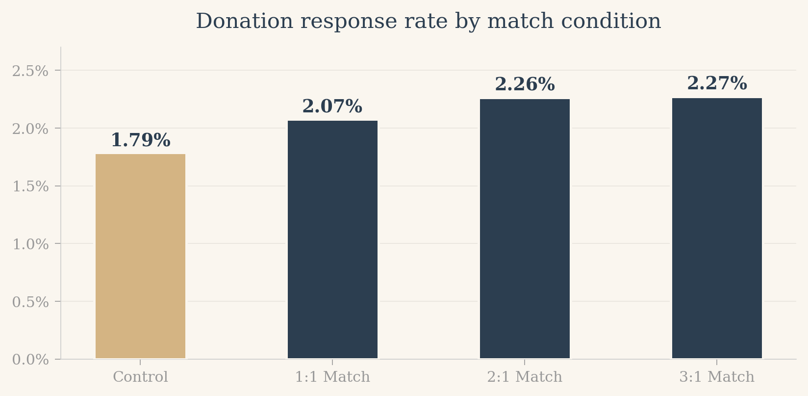
The match offer raises the response rate from 1.8% to 2.2%, a relative increase of 22%. In absolute terms that is about 4 donors per 1,000 letters, which sounds small until you remember that the organization sends these mailings to 50,000+ donors multiple times a year.
More striking is what does NOT happen: increasing the match from 1:1 to 2:1 or 3:1 barely moves the response rate (2.07% vs 2.26% vs 2.27%). Standard fundraising wisdom, which holds that richer matches are dramatically more persuasive, gets no support here.
```{python}
# Pairwise t-tests among match ratios
r1 = df[df['ratio'] == 1]['gave']
r2 = df[df['ratio2'] == 1]['gave']
r3 = df[df['ratio3'] == 1]['gave']

t12, p12 = stats.ttest_ind(r1, r2, equal_var=False)
t13, p13 = stats.ttest_ind(r1, r3, equal_var=False)

html_card = f'''
<div style="background:#faf8f5;border:1px solid rgba(44,62,80,0.1);border-radius:8px;padding:16px;margin:12px 0;border-left:3px solid #b8945a;">
<strong style="color:#2c3e50;">1:1 vs 2:1:</strong> t = {t12:.2f}, p = {p12:.2f}<br>
<strong style="color:#2c3e50;">1:1 vs 3:1:</strong> t = {t13:.2f}, p = {p13:.2f}<br>
Neither comparison rejects the null that the match ratios produce identical response rates.
</div>
'''
HTML(html_card)
```
## 4. Regression analysis
```{python}
# Table 3 replication: LPM regressions
model1 = smf.ols('gave ~ treatment', data=df).fit(cov_type='HC1')

model2 = smf.ols('gave ~ treatment + ratio2 + ratio3 + size25 + size50 + size100 + askd2 + askd3', data=df).fit(cov_type='HC1')

# Build a clean comparison table
vars_to_show = ['Intercept', 'treatment', 'ratio2', 'ratio3', 'size25', 'size50', 'size100', 'askd2', 'askd3']

rows = []
for v in vars_to_show:
    row = {'Variable': v}
    if v in model1.params.index:
        row['(1) Coef'] = f'{model1.params[v]:.4f}'
        row['(1) SE'] = f'({model1.bse[v]:.4f})'
    else:
        row['(1) Coef'] = ''
        row['(1) SE'] = ''
    if v in model2.params.index:
        row['(2) Coef'] = f'{model2.params[v]:.4f}'
        row['(2) SE'] = f'({model2.bse[v]:.4f})'
    else:
        row['(2) Coef'] = ''
        row['(2) SE'] = ''
    rows.append(row)

rows.append({'Variable': 'N', '(1) Coef': f'{int(model1.nobs):,}', '(1) SE': '', '(2) Coef': f'{int(model2.nobs):,}', '(2) SE': ''})
rows.append({'Variable': 'R-squared', '(1) Coef': f'{model1.rsquared:.4f}', '(1) SE': '', '(2) Coef': f'{model2.rsquared:.4f}', '(2) SE': ''})

reg_df = pd.DataFrame(rows)

html = '<div style="overflow-x:auto;"><table style="border-collapse:collapse;width:100%;font-size:0.88rem;">'
html += '<thead><tr style="background:#2c3e50;color:#faf8f5;">'
for col in reg_df.columns:
    html += f'<th style="padding:10px 14px;text-align:left;">{col}</th>'
html += '</tr></thead><tbody>'
for i, row in reg_df.iterrows():
    bg = '#f5efe6' if i % 2 == 0 else '#ffffff'
    html += f'<tr style="background:{bg};">'
    for col in reg_df.columns:
        html += f'<td style="padding:6px 14px;">{row[col]}</td>'
    html += '</tr>'
html += '</tbody></table></div>'
HTML(html)
```
**A note on the "probit" labeling in the paper.** The paper labels Table 3 as a probit regression, but the coefficients match the linear probability model (OLS on the binary outcome), not probit marginal effects. Running both in Python confirms this: the OLS coefficient on treatment is 0.0042, which matches the paper exactly. The probit marginal effect (using `get_margeff`) gives 0.0043, close but slightly different. For a rare outcome like this (only 2% gave), the two methods produce nearly identical numbers, so the practical conclusion is unchanged. It is a reminder that published tables sometimes have idiosyncratic labeling, and reading the replication code clarifies what was actually run.
## 5. The red/blue state twist
This is the biggest finding in the paper and the most surprising. The match offer only works in red states.
```{python}
# Red vs Blue state analysis
blue = df[df['red0'] == 0]
red = df[df['red0'] == 1]

for label, subset in [('Blue states', blue), ('Red states', red)]:
    t_sub = subset[subset['treatment'] == 1]
    c_sub = subset[subset['treatment'] == 0]
    t_stat, p_val = stats.ttest_ind(t_sub['gave'], c_sub['gave'], equal_var=False)
    diff = t_sub['gave'].mean() - c_sub['gave'].mean()
    print(f"{label} (N={len(subset):,}):")
    print(f"  Control response:   {c_sub['gave'].mean():.4f}")
    print(f"  Treatment response: {t_sub['gave'].mean():.4f}")
    print(f"  Difference: {diff:.4f}, t = {t_stat:.2f}, p = {p_val:.4f}")
    print()
```
```{python}
# Interaction model
model_int = smf.ols('gave ~ treatment + red0 + treatment:red0', data=df).fit(cov_type='HC1')

html_card = f'''
<div style="background:#faf8f5;border:1px solid rgba(44,62,80,0.1);border-radius:8px;padding:16px;margin:12px 0;border-left:3px solid #b8945a;">
<strong style="color:#2c3e50;">Interaction Model: gave ~ treatment + red0 + treatment x red0</strong><br><br>
<table style="font-size:0.88rem;">
<tr><td style="padding:2px 12px;"><strong>treatment</strong></td><td>{model_int.params["treatment"]:.4f} (p = {model_int.pvalues["treatment"]:.3f})</td></tr>
<tr><td style="padding:2px 12px;"><strong>red0</strong></td><td>{model_int.params["red0"]:.4f} (p = {model_int.pvalues["red0"]:.3f})</td></tr>
<tr><td style="padding:2px 12px;"><strong>treatment x red0</strong></td><td>{model_int.params["treatment:red0"]:.4f} (p = {model_int.pvalues["treatment:red0"]:.3f})</td></tr>
</table>
</div>
'''
HTML(html_card)
```
```{=html}
<div id="gs-redblue" class="gs-redblue">
<div class="gs-rb-grid">
<div class="gs-rb-panel" data-state="blue">
<h4 class="gs-rb-title">Blue States</h4>
<div class="gs-rb-bars">
<div class="gs-rb-bar" data-value="2.00">
<div class="gs-rb-fill gs-rb-blue-ctrl"></div>
<div class="gs-rb-label">Control</div>
<div class="gs-rb-pct gs-rb-pct-blue">0.00%</div>
</div>
<div class="gs-rb-bar" data-value="2.11">
<div class="gs-rb-fill gs-rb-blue-match"></div>
<div class="gs-rb-label">Match offered</div>
<div class="gs-rb-pct gs-rb-pct-blue">0.00%</div>
</div>
</div>
<div class="gs-rb-takeaway">No meaningful difference</div>
</div>
<div class="gs-rb-panel" data-state="red">
<h4 class="gs-rb-title">Red States</h4>
<div class="gs-rb-bars">
<div class="gs-rb-bar" data-value="1.46">
<div class="gs-rb-fill gs-rb-red-ctrl"></div>
<div class="gs-rb-label">Control</div>
<div class="gs-rb-pct gs-rb-pct-red">0.00%</div>
</div>
<div class="gs-rb-bar" data-value="2.34">
<div class="gs-rb-fill gs-rb-red-match"></div>
<div class="gs-rb-label">Match offered</div>
<div class="gs-rb-pct gs-rb-pct-red">0.00%</div>
<div class="gs-rb-callout">+60%</div>
</div>
</div>
<div class="gs-rb-takeaway">Match lifts response by 60%</div>
</div>
</div>
</div>
<style>
.gs-redblue {
max-width: 900px;
margin: 2.5rem auto;
font-family: 'Source Sans 3', 'Inter', sans-serif;
background: #faf8f5;
border: 1px solid rgba(44, 62, 80, 0.08);
border-radius: 12px;
padding: 2rem 1.5rem;
box-shadow: 0 2px 12px rgba(44, 62, 80, 0.06);
}
.gs-rb-grid {
display: grid;
grid-template-columns: 1fr 1fr;
gap: 2.5rem;
}
.gs-rb-panel { text-align: center; }
.gs-rb-title {
font-family: 'Playfair Display', Georgia, serif;
font-size: 1.4rem;
color: #2c3e50;
margin-bottom: 1.5rem;
font-weight: 500;
}
.gs-rb-bars {
display: flex;
gap: 2rem;
justify-content: center;
align-items: flex-end;
height: 280px;
padding-top: 2.5rem;
}
.gs-rb-bar {
position: relative;
width: 80px;
height: 100%;
display: flex;
flex-direction: column;
justify-content: flex-end;
}
.gs-rb-fill {
width: 100%;
background: #2c3e50;
height: 0;
border-radius: 4px 4px 0 0;
box-shadow: 0 2px 8px rgba(44, 62, 80, 0.15);
}
.gs-rb-blue-ctrl { background: #6a8eb8 !important; }
.gs-rb-blue-match { background: #2c3e50 !important; }
.gs-rb-red-ctrl { background: #c27c5a !important; }
.gs-rb-red-match { background: #7a3a3a !important; }
.gs-rb-pct-blue { color: #2c3e50 !important; }
.gs-rb-pct-red { color: #7a3a3a !important; }
.gs-rb-label {
font-size: 0.82rem;
color: #666;
margin-top: 0.6rem;
line-height: 1.3;
}
.gs-rb-pct {
position: absolute;
top: -1.8rem;
left: 50%;
transform: translateX(-50%);
font-family: 'Playfair Display', Georgia, serif;
font-weight: 600;
font-size: 1rem;
color: #2c3e50;
white-space: nowrap;
}
.gs-rb-callout {
position: absolute;
top: -3.5rem;
left: 50%;
transform: translateX(-50%);
font-family: 'Playfair Display', Georgia, serif;
color: #b8945a;
font-weight: 700;
font-size: 1.3rem;
opacity: 0;
}
.gs-rb-takeaway {
margin-top: 1.5rem;
font-style: italic;
color: #888;
font-size: 0.9rem;
}
@media (max-width: 600px) {
.gs-rb-grid { grid-template-columns: 1fr; gap: 2rem; }
.gs-rb-bars { height: 220px; }
}
</style>
<script>
(function() {
var container = document.getElementById('gs-redblue');
if (!container) return;
var fired = false;
function runRedBlue() {
if (fired) return;
if (typeof gsap === 'undefined') return;
fired = true;
var maxVal = 2.5;
var maxPx = 240;
var bars = container.querySelectorAll('.gs-rb-bar');
bars.forEach(function(bar, i) {
var val = parseFloat(bar.getAttribute('data-value'));
var fill = bar.querySelector('.gs-rb-fill');
var pct = bar.querySelector('.gs-rb-pct');
var counter = { v: 0 };
var targetH = Math.round((val / maxVal) * maxPx);
fill.style.height = '0px';
gsap.to(fill, {
height: targetH + 'px',
duration: 1.2,
ease: 'power2.out',
delay: i * 0.08
});
gsap.to(counter, {
v: val,
duration: 1.2,
ease: 'power2.out',
delay: i * 0.08,
onUpdate: function() {
pct.textContent = counter.v.toFixed(2) + '%';
}
});
});
var callout = container.querySelector('.gs-rb-callout');
if (callout) {
gsap.to(callout, {
opacity: 1,
y: -5,
duration: 0.6,
ease: 'back.out(1.4)',
delay: 1.0
});
}
var takeaways = container.querySelectorAll('.gs-rb-takeaway');
takeaways.forEach(function(el, i) {
gsap.fromTo(el,
{ opacity: 0, y: 10 },
{ opacity: 1, y: 0, duration: 0.5, delay: 1.2 + i * 0.15 }
);
});
}
var observer = new IntersectionObserver(function(entries) {
entries.forEach(function(entry) {
if (entry.isIntersecting) {
runRedBlue();
observer.disconnect();
}
});
}, { threshold: 0.1, rootMargin: '0px 0px -80px 0px' });
observer.observe(container);
})();
</script>
```
The match offer only works in red states. In blue states, treatment and control response rates are statistically identical (2.11% vs 2.00%). In red states, the treatment rate (2.34%) is about 60% higher than the control rate (1.46%). The interaction of treatment x red_state is positive and highly significant (0.0078, p = 0.005), confirming the split is real, not noise.
This is a liberal nonprofit soliciting donations for civil liberties and church-state separation. You might expect the match to work better among its natural base (blue-state liberals), but the opposite happens. The authors speculate about social identity theory: donors in the political minority within their state may have latent identities that get activated by the "fellow member" framing, making them more responsive to a peer-style signal. Whatever the mechanism, the practical point stands: the same A/B test would have produced very different conclusions depending on which states were sampled, a warning about external validity even within a single country.
## 6. What this teaches about randomization and causal inference
Three things make the causal claim in this paper particularly clean:
1. **The randomization is real.** Treatment was assigned by the researchers, not self-selected. We verified in Section 2 that the groups look balanced on every measured pre-treatment variable. This is the crucial assumption: no systematic selection into treatment.
2. **The treatment is sharply defined.** It is one paragraph of text in a direct-mail letter. Everything else about the solicitation is identical between arms. There is no hidden bundling of interventions.
3. **The outcome is measured cleanly.** The organization tracks every donation that arrives within a month; there is no self-reporting, no recall bias.
Given these three, the difference in means between treatment and control is an unbiased estimate of the average treatment effect in this sample. The standard errors come from the sampling variability of who happened to donate within each randomly assigned group, which is exactly what frequentist inference is built for (CASI Ch. 3).
The red/blue result adds a subtle but important caveat: even a clean RCT only gives you the ATE in the population you sampled from. Heterogeneity can be large, and what works for the "average" donor may not work for the subgroup you care about.