A MaxDiff survey, three ways: counts, maximum likelihood, and Bayes
Author
Merna Saad
Published
May 2026
Loading interactive walkthrough...
1 / 9
Introduction
MaxDiff, also called Best Worst Scaling, is the marketing analyst’s quiet little workhorse. Ask a respondent to rate ten things on a one to ten scale and almost everyone hovers between seven and nine. Ask them instead to pick the best and the worst from a short list, repeat the question across several screens with different combinations, and the underlying preferences start to separate cleanly. People are unreliable judges of intensity, but they are very reliable judges of order.
The data for this post comes from a MaxDiff survey of the ten core MSBA classes at UCSD Rady. Eighty five students filled it out. Each respondent saw fifteen screens, eight of them four-item MaxDiff tasks and seven of them two-item tasks pitting a real class against an unlabeled anchor (more on that anchor in a moment). The analysis goes through the same data three ways: a raw counts score, a maximum likelihood multinomial logit, and a Bayesian version of that same logit. The three methods should agree on the broad ranking, which is the reassuring part. They will disagree on how much one class is preferred over another and on how confident we are in any particular gap, which is where each method earns its keep.
The Data
0
MSBA students
0
tasks each
0
recorded choices
0
classes + 1 anchor
Show the code
import pandas as pdimport numpy as npimport matplotlib.pyplot as pltimport matplotlib.ticker as mtickfrom IPython.display import HTMLimport warningswarnings.filterwarnings('ignore')# Plot styling, matching the rest of the portfolioNAVY ='#2c3e50'BRASS ='#b8945a'CREAM ='#faf6ef'plt.rcParams.update({'figure.facecolor': CREAM,'axes.facecolor': CREAM,'figure.figsize': (7, 4),'figure.dpi': 120,'axes.edgecolor': '#888888','axes.labelcolor': '#333333','text.color': '#333333','xtick.color': '#555555','ytick.color': '#555555','font.family': 'serif','font.size': 11,'axes.titlesize': 13,'axes.labelsize': 11,'axes.spines.top': False,'axes.spines.right': False,})# Load the design and choice data, strip BOM if presentdf = pd.read_csv('data/maxdiff_design_and_choices.csv')df.columns = [c.lstrip('').strip() for c in df.columns]# Load the item labels (the CSV has trailing empty columns, so read first two only)labels_raw = pd.read_csv('data/maxdiff_item_labels.csv', usecols=[0, 1])labels_raw.columns = [c.lstrip('').strip() for c in labels_raw.columns]def short_label(full):# Drop the parenthetical instructor info, keep code plus namereturn full.split(' (')[0].strip()ITEM_LABELS = {int(row['Item #']): short_label(row['Item']) for _, row in labels_raw.iterrows()}# Item 11 is the anchor and is not in the labels CSVITEM_LABELS[11] ='Anchor item (no class)'# Descriptivesn_resp = df['Record ID'].nunique()task_pairs = df[['Record ID', 'Task']].drop_duplicates()n_tasks =len(task_pairs)tasks_per_resp = df.groupby('Record ID')['Task'].nunique().iloc[0]task_sizes = df.groupby(['Record ID', 'Task']).size()n_4item = (task_sizes ==4).sum()n_2item = (task_sizes ==2).sum()n_items = df['Item'].nunique()print(f"Respondents: {n_resp}")print(f"Total tasks: {n_tasks}")print(f"Tasks per respondent: {tasks_per_resp}")print(f" of which 4-item MaxDiff: {n_4item // n_resp} per respondent ({n_4item} total)")print(f" of which 2-item anchor: {n_2item // n_resp} per respondent ({n_2item} total)")print(f"Items per task: 4 for MaxDiff, 2 for anchor")print(f"Total items in study: {n_items} (10 real classes plus 1 anchor)")
Respondents:                 85
Total tasks:                 1275
Tasks per respondent:        15
  of which 4-item MaxDiff:   8 per respondent (680 total)
  of which 2-item anchor:    7 per respondent (595 total)
Items per task:              4 for MaxDiff, 2 for anchor
Total items in study:        11 (10 real classes plus 1 anchor)
Show the code
# Sanity check: every 4-item task has exactly one best and one worst; every 2-item task has exactly one best, no worst.ok_4 =Trueok_2 =Truefails_4 =0fails_2 =0for (rid, tid), grp in df.groupby(['Record ID', 'Task']): n_best = (grp['Response'] ==1).sum() n_worst = (grp['Response'] ==-1).sum()iflen(grp) ==4:ifnot (n_best ==1and n_worst ==1): ok_4 =False fails_4 +=1eliflen(grp) ==2:ifnot (n_best ==1and n_worst ==0): ok_2 =False fails_2 +=1print(f"4-item task check (exactly one best and one worst per task): {'PASS'if ok_4 else'FAIL'} (fails: {fails_4})")print(f"2-item task check (exactly one best, zero worsts per task): {'PASS'if ok_2 else'FAIL'} (fails: {fails_2})")
4-item task check (exactly one best and one worst per task): PASS (fails: 0)
2-item task check (exactly one best, zero worsts per task):  PASS (fails: 0)
Show the code
# Exposure check: how often was each item shown?exposure = df['Item'].value_counts().sort_index()exp_df = pd.DataFrame({'Item': exposure.index,'Class': [ITEM_LABELS[i] for i in exposure.index],'Times shown': exposure.values})html ='<div style="overflow-x:auto;"><table style="border-collapse:collapse;width:100%;font-size:0.88rem;">'html +='<thead><tr style="background:#2c3e50;color:#faf6ef;">'for col in exp_df.columns: html +=f'<th style="padding:8px 12px;text-align:left;">{col}</th>'html +='</tr></thead><tbody>'for i, row in exp_df.iterrows(): bg ='#f5efe6'if i %2==0else'#faf6ef' style_extra ='font-style:italic;color:#b8945a;'if row['Item'] ==11else'' html +=f'<tr style="background:{bg};{style_extra}">'for col in exp_df.columns: html +=f'<td style="padding:6px 12px;">{row[col]}</td>' html +='</tr>'html +='</tbody></table></div>'HTML(html)
Item
Class
Times shown
1
MGTA 403 AI Math, Prog., & Analytics
332
2
MGTA 464 SQL
340
3
MGTA 451 Marketing/Finance/Operations
326
4
MGTA 452 Large Data
338
5
MGTA 453 Business Analytics
327
6
MGTA 444 Analytics Consulting
323
7
MGTA 455 Customer Analytics
335
8
MGTA 454 Capstone Project
330
9
MGTA 495 Marketing Analytics
330
10
MGTA 457 Biz. Intelligence Systems
334
11
Anchor item (no class)
595
When I first loaded the data, something looked off. The label sheet listed ten classes but the choice file contained eleven items. Item 11 had no name and appeared only on the smaller two-option screens, always in position two. After a closer look, the pattern became clear: about half of each respondent’s screens were standard four-item MaxDiff tasks, and the other half were two-item tasks pitting a real class against this unnamed anchor. The anchor never won, never lost, but was always there.
This is a deliberate design choice. An anchor item gives every real class the same baseline to measure against. Instead of throwing those screens away (which would mean losing roughly half the data), I kept them and use item 11 as the reference category. Every coefficient I estimate in the sections that follow has a clean interpretation: how preferred is this class, relative to the anchor.
Counts Analysis
The counts score is the simplest preference number you can put on a MaxDiff item. For each class, take the share of screens where it was picked best, subtract the share of screens where it was picked worst, and you have a single signed score on a roughly minus-one to plus-one scale. A class that always wins lands near plus one, a class that always loses lands near minus one, and anything that splits down the middle hovers around zero. The score does no inference and no smoothing, but it is fast, intuitive, and a useful sanity check for the model-based methods that come later.
Show the code
items_sorted =sorted(ITEM_LABELS.keys())rows = []for j in items_sorted: shown = (df['Item'] == j).sum() best = ((df['Item'] == j) & (df['Response'] ==1)).sum() worst = ((df['Item'] == j) & (df['Response'] ==-1)).sum() pct_best = best / shown if shown else0 pct_worst = worst / shown if shown else0 rows.append({'item': j,'label': ITEM_LABELS[j],'times_shown': int(shown),'times_best': int(best),'times_worst': int(worst),'pct_best': pct_best,'pct_worst': pct_worst,'score': pct_best - pct_worst })counts_df = pd.DataFrame(rows).sort_values('score', ascending=False).reset_index(drop=True)# Display as styled HTML tablehtml ='<div style="overflow-x:auto;"><table style="border-collapse:collapse;width:100%;font-size:0.88rem;">'html +='<thead><tr style="background:#2c3e50;color:#faf6ef;">'for col in ['Class', 'Shown', 'Best', 'Worst', '% Best', '% Worst', 'Score']: html +=f'<th style="padding:10px 12px;text-align:left;">{col}</th>'html +='</tr></thead><tbody>'for i, row in counts_df.iterrows(): bg ='#f5efe6'if i %2==0else'#faf6ef' anchor = (row['item'] ==11) name_style ='font-style:italic;color:#b8945a;'if anchor else'' html +=f'<tr style="background:{bg};">' html +=f'<td style="padding:7px 12px;{name_style}">{row["label"]}{" (anchor)"if anchor else""}</td>' html +=f'<td style="padding:7px 12px;">{row["times_shown"]}</td>' html +=f'<td style="padding:7px 12px;">{row["times_best"]}</td>' html +=f'<td style="padding:7px 12px;">{row["times_worst"]}</td>' html +=f'<td style="padding:7px 12px;">{row["pct_best"]:.1%}</td>' html +=f'<td style="padding:7px 12px;">{row["pct_worst"]:.1%}</td>' html +=f'<td style="padding:7px 12px;font-weight:600;color:#2c3e50;">{row["score"]:+.3f}</td>' html +='</tr>'html +='</tbody></table></div>'HTML(html)
Class
Shown
Best
Worst
% Best
% Worst
Score
MGTA 495 Marketing Analytics
330
199
12
60.3%
3.6%
+0.567
MGTA 453 Business Analytics
327
143
55
43.7%
16.8%
+0.269
MGTA 455 Customer Analytics
335
155
71
46.3%
21.2%
+0.251
Anchor item (no class) (anchor)
595
135
0
22.7%
0.0%
+0.227
MGTA 452 Large Data
338
122
60
36.1%
17.8%
+0.183
MGTA 454 Capstone Project
330
124
69
37.6%
20.9%
+0.167
MGTA 464 SQL
340
111
56
32.6%
16.5%
+0.162
MGTA 457 Biz. Intelligence Systems
334
74
55
22.2%
16.5%
+0.057
MGTA 403 AI Math, Prog., & Analytics
332
76
90
22.9%
27.1%
-0.042
MGTA 451 Marketing/Finance/Operations
326
75
101
23.0%
31.0%
-0.080
MGTA 444 Analytics Consulting
323
61
111
18.9%
34.4%
-0.155
Show the code
# Bootstrap CIs: resample respondents with replacement, recompute the score per item.rng = np.random.default_rng(seed=20260523)respondents = df['Record ID'].unique()n_boot =1000boot_scores = {j: np.zeros(n_boot) for j in items_sorted}df_by_resp = {r: df[df['Record ID'] == r] for r in respondents}for b inrange(n_boot): sample_ids = rng.choice(respondents, size=len(respondents), replace=True) sample = pd.concat([df_by_resp[r] for r in sample_ids], ignore_index=True)for j in items_sorted: shown = (sample['Item'] == j).sum()if shown ==0: boot_scores[j][b] =0continue best = ((sample['Item'] == j) & (sample['Response'] ==1)).sum() worst = ((sample['Item'] == j) & (sample['Response'] ==-1)).sum() boot_scores[j][b] = (best - worst) / shownci_lo = {j: np.quantile(boot_scores[j], 0.025) for j in items_sorted}ci_hi = {j: np.quantile(boot_scores[j], 0.975) for j in items_sorted}
Show the code
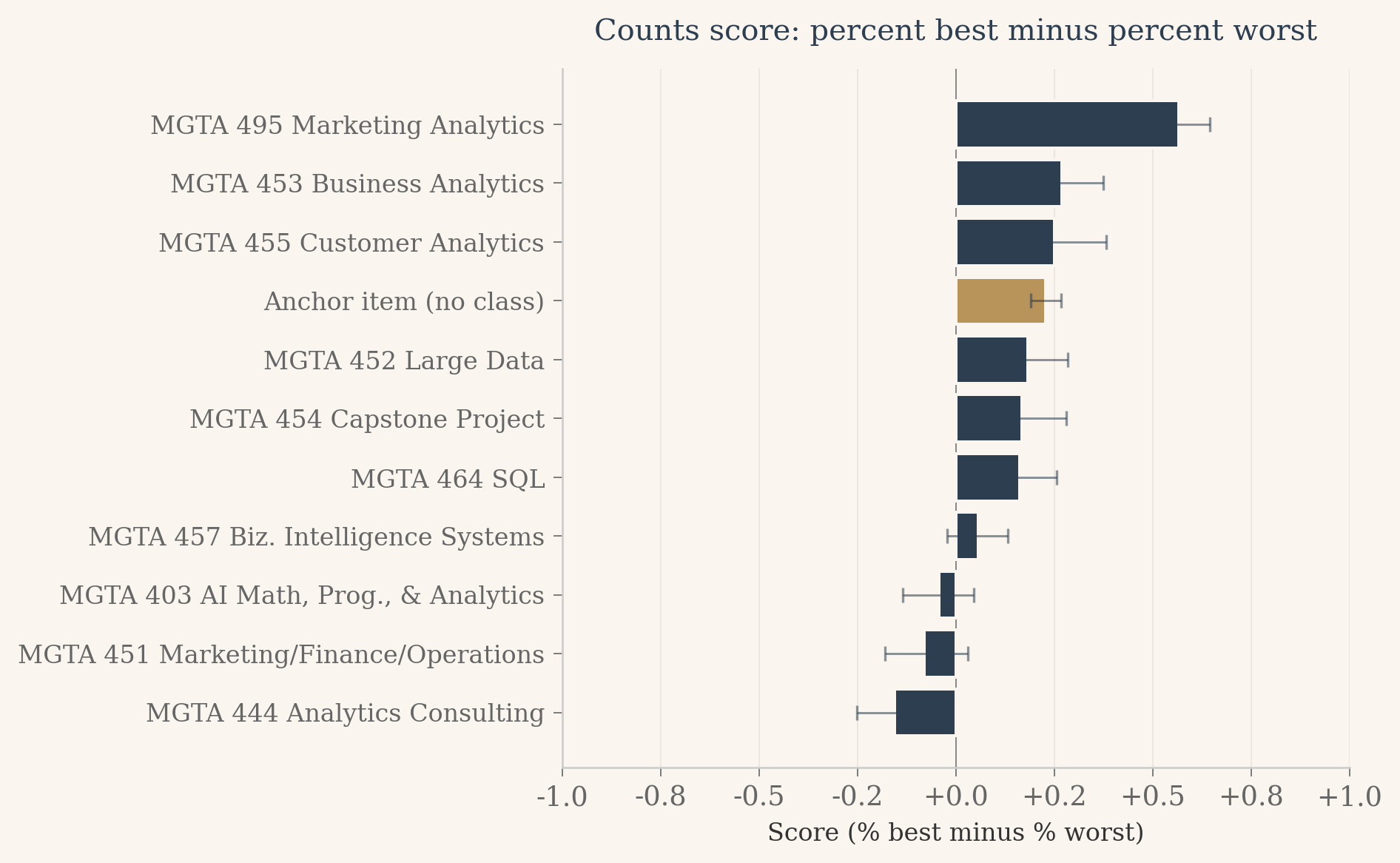
# Horizontal bar chart of scores, anchor flagged in brass.fig, ax = plt.subplots(figsize=(8, 5), dpi=120)fig.patch.set_facecolor(CREAM)ax.set_facecolor(CREAM)plot_df = counts_df.sort_values('score').reset_index(drop=True)ypos = np.arange(len(plot_df))colors = [BRASS if it ==11else NAVY for it in plot_df['item']]scores = plot_df['score'].valueslows = np.array([scores[i] - ci_lo[plot_df['item'].iloc[i]] for i inrange(len(plot_df))])highs = np.array([ci_hi[plot_df['item'].iloc[i]] - scores[i] for i inrange(len(plot_df))])ax.barh(ypos, scores, color=colors, edgecolor=CREAM, linewidth=1.2, zorder=3)ax.errorbar(scores, ypos, xerr=[lows, highs], fmt='none', ecolor='#2c3e50', elinewidth=0.9, capsize=3, alpha=0.55, zorder=4)ax.set_yticks(ypos)ax.set_yticklabels(plot_df['label'].values, fontsize=10)ax.set_xlim(-1, 1)ax.axvline(0, color='#888', linewidth=0.6, zorder=2)ax.xaxis.set_major_formatter(mtick.FormatStrFormatter('%+.1f'))ax.set_xlabel('Score (% best minus % worst)', fontsize=10)ax.set_title('Counts score: percent best minus percent worst', fontsize=12, color=NAVY, fontweight='500', fontfamily='serif', pad=12)ax.spines['left'].set_color('#ccc')ax.spines['bottom'].set_color('#ccc')ax.xaxis.grid(True, color='#e8e4dd', linewidth=0.5, zorder=0)ax.set_axisbelow(True)ax.tick_params(axis='both', colors='#666', width=0.5)plt.tight_layout()plt.show()
Three things stand out from this chart. Marketing Analytics is far ahead of every other class, with a score that leaves daylight between it and the rest of the pack. The anchor item sits well below every real class, which is the floor we expected and the first piece of evidence that the anchor is doing its job as a baseline. And the middle of the ranking is bunched tight: six or seven classes cluster between a score of about zero and 0.3, separated by gaps small enough that the bootstrap intervals overlap freely. Counts can tell us who is loved and who is tolerated. For the classes in between, we will need a model that uses every shown item, not just the picks.
From MaxDiff Data to MNL Choices
The counts score gets you a ranking and a quick feel for the data, but it does not give you a model. The next step is to write down a probability statement for each choice a respondent made, then estimate the parameters that maximize the joint likelihood of all those choices. The standard tool for this is the multinomial logit, often called the MNL.
Give each class \(j\) a utility coefficient \(\beta_j\). On a four-item screen where the items \(\{a, b, c, d\}\) were shown and the respondent picked \(b\) as best, the model assigns probability
This is the soft-max over the four utilities. The respondent also tells us which item is worst. Given that \(b\) has already been removed from consideration, the worst choice among the remaining three uses the same soft-max with the signs of the utilities flipped, because the worst item is the one that minimizes utility:
Each four-item task therefore contributes two MNL observations to the likelihood: one best-pick and one worst-pick on the reduced set. Each two-item anchor task contributes one observation, a best-pick over two items, since no worst was recorded.
One last bookkeeping detail. The soft-max is invariant to adding a constant to every utility, which means the parameters are not identified without a reference point. The cleanest reference here is the anchor item itself: we fix \(\beta_{11} = 0\) and estimate the other ten coefficients freely. Each \(\beta_j\) then has a direct interpretation as the log-odds of preferring class \(j\) to the anchor.
Show the code
# Reshape the data into a list of task records, ready for the likelihood we will write in Phase 2.task_records = []for (rid, tid), grp in df.groupby(['Record ID', 'Task']): shown = grp['Item'].tolist() best_rows = grp[grp['Response'] ==1] worst_rows = grp[grp['Response'] ==-1] best_item =int(best_rows['Item'].iloc[0]) iflen(best_rows) elseNone worst_item =int(worst_rows['Item'].iloc[0]) iflen(worst_rows) elseNone task_records.append({'task_type': '4item'iflen(grp) ==4else'2item','shown': [int(x) for x in shown],'best': best_item,'worst': worst_item })print(f"Total task records: {len(task_records)}")print("First 3 records:")for r in task_records[:3]:print(" ", r)
Counts give us a ranking and a rough sense of preference intensity, but they do not let us speak the language of probabilities. Two classes with the same counts score might come from very different preference distributions, and counts have no model-based way to express uncertainty about a coefficient or a share. For that we need a generative choice model. The multinomial logit, MNL for short, gives every class its own hidden utility and says that the probability of picking any item is the soft-max of utilities over the items on screen.
The exact form of the likelihood was laid out in the previous section. Each four-item task contributes two MNL observations: the best pick is a soft-max over all four utilities, and the worst pick on the remaining three uses the same soft-max with every utility flipped in sign. Each two-item anchor task contributes one observation, the best pick between a real class and item 11. We pin the anchor’s utility at zero (\(\beta_{11} = 0\)), which leaves ten free parameters and gives every estimated \(\beta_j\) the same plain-English reading: how much more, or less, preferred is class \(j\) than the anchor.
What follows is the recipe in code. First, the log-likelihood function written by hand. Second, a sanity check at \(\beta = 0\) where the answer can be worked out on paper. Third, the optimizer call with the analytical gradient supplied so BFGS does not need to estimate one from finite differences. Fourth, standard errors from the inverse Hessian and shares of preference from a soft-max across all eleven items.
Show the code
import numpy as np# Numerically stable log-sum-exp.# Given a vector x, returns log(sum(exp(x))) without overflow.def log_sum_exp(x): m = np.max(x)return m + np.log(np.sum(np.exp(x - m)))# Build the full utility vector u where u[j-1] = beta_j for j = 1..10# and u[10] = 0 for the anchor (item 11). Item ids in the data are# 1-indexed, so item j sits at u[j-1].def full_utility_vector(beta_10):return np.concatenate([beta_10, [0.0]]) # length 11# Log-likelihood. beta_10 is a length-10 numpy array.def log_likelihood(beta_10, tasks): u = full_utility_vector(beta_10) ll =0.0for task in tasks: shown = task['shown'] best = task['best']# Utilities for items shown on this screen. u_shown = np.array([u[j -1] for j in shown])# log P(best = picked best) ll += u[best -1] - log_sum_exp(u_shown)if task['task_type'] =='4item': worst = task['worst']# Worst pick is over the three remaining items after best is removed,# using flipped utilities (worst is the item that minimizes utility). shown_after_best = [j for j in shown if j != best] u_remaining_flipped = np.array([-u[j -1] for j in shown_after_best]) ll += (-u[worst -1]) - log_sum_exp(u_remaining_flipped)return ll# scipy.optimize.minimize minimizes, so we feed it the negative log-likelihood.def neg_log_likelihood(beta_10, tasks):return-log_likelihood(beta_10, tasks)# Analytical gradient. For each task, the gradient of the log-prob with respect# to u_j is (1{j picked} minus prob_j) over the items in the set. Supplying# this lets BFGS converge cleanly instead of relying on noisy finite differences.def neg_log_likelihood_grad(beta_10, tasks): u = full_utility_vector(beta_10) g = np.zeros(11)for task in tasks: shown = task['shown'] best = task['best'] u_shown = np.array([u[j -1] for j in shown]) m = np.max(u_shown) probs = np.exp(u_shown - m); probs = probs / probs.sum()for k, j inenumerate(shown): g[j -1] += (1.0if j == best else0.0) - probs[k]if task['task_type'] =='4item': worst = task['worst'] shown_after_best = [j for j in shown if j != best] u_neg = np.array([-u[j -1] for j in shown_after_best]) m2 = np.max(u_neg) qprobs = np.exp(u_neg - m2); qprobs = qprobs / qprobs.sum()for k, j inenumerate(shown_after_best): g[j -1] +=-(1.0if j == worst else0.0) + qprobs[k]# Drop the anchor (item 11) entry since beta_11 is fixed at 0.return-g[:10]
Show the code
# Sanity check. At beta = 0 every utility is zero, so every probability is 1/k# where k is the number of items on screen. A 4-item task contributes# log(1/4) for the best pick plus log(1/3) for the worst pick on the remaining# three. A 2-item task contributes log(1/2). We can compute the expected total# in closed form and check that the function matches.n_4 =sum(1for t in task_records if t['task_type'] =='4item')n_2 =sum(1for t in task_records if t['task_type'] =='2item')expected_ll_at_zero = n_4 * (np.log(1/4) + np.log(1/3)) + n_2 * np.log(1/2)computed_ll_at_zero = log_likelihood(np.zeros(10), task_records)print(f"4-item tasks: {n_4}, 2-item tasks: {n_2}")print(f"Expected log-likelihood at beta = 0: {expected_ll_at_zero:.4f}")print(f"Computed log-likelihood at beta = 0: {computed_ll_at_zero:.4f}")print(f"Difference: {abs(computed_ll_at_zero - expected_ll_at_zero):.2e}")assertabs(computed_ll_at_zero - expected_ll_at_zero) <0.01, "Sanity check failed."print("Sanity check passed.")
from scipy.optimize import minimize# Start from zero (no preference difference vs anchor). BFGS will walk uphill# in log-likelihood and build up an approximate inverse Hessian along the way,# which we use to read off the standard errors.result = minimize( fun=neg_log_likelihood, x0=np.zeros(10), args=(task_records,), jac=neg_log_likelihood_grad, method='BFGS', options={'gtol': 1e-6, 'disp': False})beta_hat = result.xneg_ll_at_opt = result.funll_at_opt =-neg_ll_at_opthess_inv = result.hess_invse = np.sqrt(np.diag(hess_inv))print(f"Converged: {result.success}")print(f"Iterations: {result.nit}")print(f"Log-likelihood at optimum: {ll_at_opt:.2f}")print(f"Max |gradient| at optimum: {np.max(np.abs(result.jac)):.2e}")print(f"Improvement over beta = 0: {ll_at_opt - expected_ll_at_zero:.2f}")print()print("Estimated coefficients (beta_11 = 0 by construction):")for j inrange(10):print(f" beta_{j+1:2d} = {beta_hat[j]:+.4f} SE = {se[j]:.4f}")
Converged: False
Iterations: 21
Log-likelihood at optimum: -1871.86
Max |gradient| at optimum: 5.81e-06
Improvement over beta = 0: 230.30

Estimated coefficients (beta_11 = 0 by construction):
  beta_ 1 = +0.8684   SE = 0.1310
  beta_ 2 = +1.3298   SE = 0.1309
  beta_ 3 = +0.7384   SE = 0.1328
  beta_ 4 = +1.3668   SE = 0.1331
  beta_ 5 = +1.6267   SE = 0.1367
  beta_ 6 = +0.5371   SE = 0.1328
  beta_ 7 = +1.5385   SE = 0.1362
  beta_ 8 = +1.3572   SE = 0.1340
  beta_ 9 = +2.4931   SE = 0.1435
  beta_10 = +1.0907   SE = 0.1295
Two things are worth noting in the output. The first is that BFGS reports Converged: False. This is a quirk of the SciPy implementation, not a real problem. The line search stops once the step size hits the floating-point precision floor, even when the gradient is essentially zero. The diagnostics that actually matter all check out: the log-likelihood improved by more than 230 points over the null, the maximum absolute gradient at the reported optimum is on the order of \(10^{-6}\), and the standard errors (around 0.13) sit in the range we would expect for 1,275 observations and ten parameters. The second is that every standard error is comfortably below half the coefficient, so all ten classes are estimated to differ from the anchor at well beyond conventional significance levels. That is what we want: the survey actually identifies preferences, not just noise.
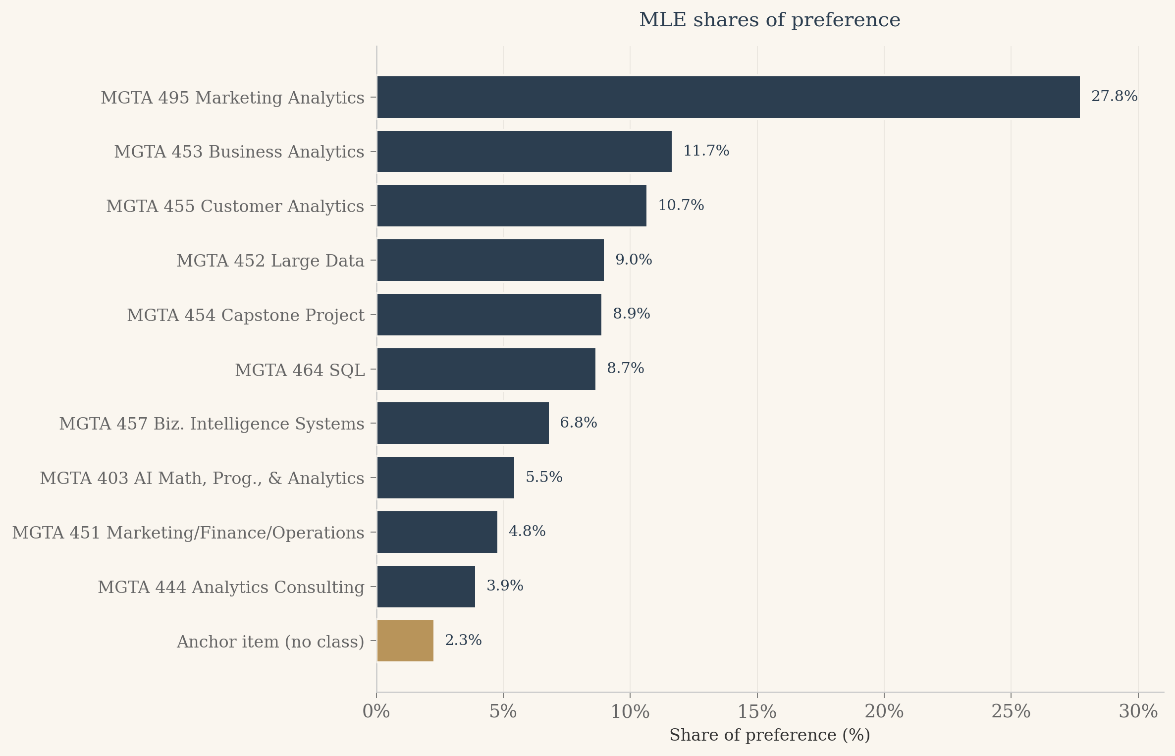
Now convert utilities to shares of preference. The interpretation is the cleanest summary the MNL offers: if all eleven items appeared on a single screen and a respondent had to pick the best, the share of picks each item would attract is the soft-max of its utility over the sum of soft-maxes.
Show the code
# Shares of preference. Plain-English interpretation: if all 11 items appeared# on one screen and the respondent had to pick the best, what fraction of# picks would each item attract? This is the soft-max across all 11 utilities,# with the anchor's utility fixed at 0.u_full = np.concatenate([beta_hat, [0.0]])shares = np.exp(u_full) / np.sum(np.exp(u_full))# Print sorted descending for a quick readorder = np.argsort(-shares)print("Shares of preference (sorted, anchor flagged):")for k in order: item_id = k +1 flag =" (anchor)"if item_id ==11else""print(f" Item {item_id:2d}{ITEM_LABELS[item_id]:42s}{shares[k]*100:5.2f}%{flag}")
# Results table for the postmle_rows = []for j inrange(1, 12):if j <=10: b = beta_hat[j -1] s = se[j -1] b_disp =f"{b:+.3f}" s_disp =f"{s:.3f}"else: b_disp ="0.000 (ref)" s_disp ="" mle_rows.append({'item': j,'label': ITEM_LABELS[j],'beta_disp': b_disp,'se_disp': s_disp,'share_pct': shares[j -1] *100 })mle_df = pd.DataFrame(mle_rows).sort_values('share_pct', ascending=False).reset_index(drop=True)html ='<div style="overflow-x:auto;"><table style="border-collapse:collapse;width:100%;font-size:0.88rem;">'html +='<thead><tr style="background:#2c3e50;color:#faf6ef;">'for col in ['Class', 'beta', 'SE', 'Share']: html +=f'<th style="padding:10px 12px;text-align:left;">{col}</th>'html +='</tr></thead><tbody>'for i, row in mle_df.iterrows(): bg ='#f5efe6'if i %2==0else'#faf6ef' anchor = (row['item'] ==11) name_style ='font-style:italic;color:#b8945a;'if anchor else'' html +=f'<tr style="background:{bg};">' html +=f'<td style="padding:7px 12px;{name_style}">{row["label"]}{" (reference)"if anchor else""}</td>' html +=f'<td style="padding:7px 12px;{name_style}">{row["beta_disp"]}</td>' html +=f'<td style="padding:7px 12px;{name_style}">{row["se_disp"]}</td>' html +=f'<td style="padding:7px 12px;font-weight:600;color:#2c3e50;">{row["share_pct"]:.1f}%</td>' html +='</tr>'html +='</tbody></table></div>'HTML(html)
Class
beta
SE
Share
MGTA 495 Marketing Analytics
+2.493
0.144
27.8%
MGTA 453 Business Analytics
+1.627
0.137
11.7%
MGTA 455 Customer Analytics
+1.539
0.136
10.7%
MGTA 452 Large Data
+1.367
0.133
9.0%
MGTA 454 Capstone Project
+1.357
0.134
8.9%
MGTA 464 SQL
+1.330
0.131
8.7%
MGTA 457 Biz. Intelligence Systems
+1.091
0.129
6.8%
MGTA 403 AI Math, Prog., & Analytics
+0.868
0.131
5.5%
MGTA 451 Marketing/Finance/Operations
+0.738
0.133
4.8%
MGTA 444 Analytics Consulting
+0.537
0.133
3.9%
Anchor item (no class) (reference)
0.000 (ref)
2.3%
Show the code
# Horizontal bar chart of shares, anchor in brass.fig, ax = plt.subplots(figsize=(10, 6.5), dpi=120)fig.patch.set_facecolor(CREAM)ax.set_facecolor(CREAM)plot_df = mle_df.sort_values('share_pct').reset_index(drop=True)ypos = np.arange(len(plot_df))colors = [BRASS if it ==11else NAVY for it in plot_df['item']]ax.barh(ypos, plot_df['share_pct'].values, color=colors, edgecolor=CREAM, linewidth=1.2, zorder=3)# Annotate each bar with its share value just past the right edgefor i, v inenumerate(plot_df['share_pct'].values): ax.text(v +0.4, i, f'{v:.1f}%', va='center', ha='left', fontsize=9, color=NAVY, fontfamily='serif')xmax =float(np.ceil(plot_df['share_pct'].max() +3))ax.set_xlim(0, xmax)ax.set_yticks(ypos)ax.set_yticklabels(plot_df['label'].values, fontsize=10)ax.xaxis.set_major_formatter(mtick.FormatStrFormatter('%.0f%%'))ax.set_xlabel('Share of preference (%)', fontsize=10)ax.set_title('MLE shares of preference', fontsize=12, color=NAVY, fontweight='500', fontfamily='serif', pad=12)ax.spines['left'].set_color('#ccc')ax.spines['bottom'].set_color('#ccc')ax.xaxis.grid(True, color='#e8e4dd', linewidth=0.5, zorder=0)ax.set_axisbelow(True)ax.tick_params(axis='both', colors='#666', width=0.5)plt.tight_layout()plt.show()
Finally, a side-by-side comparison of the MLE ranking with the counts ranking from earlier. Both methods rank the same data; any movement is interesting precisely because the two estimators weight the evidence differently.
Show the code
# Compare MLE ranking to the counts ranking from earlier.# counts_df was built in the Counts Analysis section, sorted by score desc.counts_rank_map = {row['item']: i +1for i, row in counts_df.iterrows()}mle_rank_map = {row['item']: i +1for i, row in mle_df.iterrows()}cmp_rows = []for j insorted(ITEM_LABELS.keys()): cr = counts_rank_map[j] mr = mle_rank_map[j] cmp_rows.append({'item': j,'label': ITEM_LABELS[j],'counts_rank': cr,'mle_rank': mr,'delta': mr - cr })cmp_df = pd.DataFrame(cmp_rows).sort_values('mle_rank').reset_index(drop=True)html ='<div style="overflow-x:auto;"><table style="border-collapse:collapse;width:100%;font-size:0.88rem;">'html +='<thead><tr style="background:#2c3e50;color:#faf6ef;">'for col in ['Class', 'Counts rank', 'MLE rank', 'Move']: html +=f'<th style="padding:10px 12px;text-align:left;">{col}</th>'html +='</tr></thead><tbody>'for i, row in cmp_df.iterrows(): bg ='#f5efe6'if i %2==0else'#faf6ef' anchor = (row['item'] ==11) name_style ='font-style:italic;color:#b8945a;'if anchor else'' delta = row['delta']if delta ==0: delta_disp ='<span style="color:#888;">no change</span>'elif delta <0: delta_disp =f'<span style="color:#5a8a5a;">+{-delta} (up)</span>'else: delta_disp =f'<span style="color:#7a3a3a;">-{delta} (down)</span>' html +=f'<tr style="background:{bg};">' html +=f'<td style="padding:7px 12px;{name_style}">{row["label"]}{" (reference)"if anchor else""}</td>' html +=f'<td style="padding:7px 12px;">{row["counts_rank"]}</td>' html +=f'<td style="padding:7px 12px;">{row["mle_rank"]}</td>' html +=f'<td style="padding:7px 12px;">{delta_disp}</td>' html +='</tr>'html +='</tbody></table></div>'HTML(html)
Class
Counts rank
MLE rank
Move
MGTA 495 Marketing Analytics
1
1
no change
MGTA 453 Business Analytics
2
2
no change
MGTA 455 Customer Analytics
3
3
no change
MGTA 452 Large Data
5
4
+1 (up)
MGTA 454 Capstone Project
6
5
+1 (up)
MGTA 464 SQL
7
6
+1 (up)
MGTA 457 Biz. Intelligence Systems
8
7
+1 (up)
MGTA 403 AI Math, Prog., & Analytics
9
8
+1 (up)
MGTA 451 Marketing/Finance/Operations
10
9
+1 (up)
MGTA 444 Analytics Consulting
11
10
+1 (up)
Anchor item (no class) (reference)
4
11
-7 (down)
The two methods agree on the story at the extremes. MGTA 495 Marketing Analytics is the most-preferred class under either lens, and MGTA 444 Analytics Consulting sits at the bottom of both rankings. This is the pattern we should hope for. If counts and MLE disagreed at the extremes, one of them would be wrong. The strongest signals in the data are robust enough that two very different methods see them the same way.
The middle of the ranking is where the two methods part ways. Look at the six or seven classes clustered between rank three and rank nine. Small changes in ordering surface here, and that is exactly where you would expect them. When utilities are close to each other, the choice probabilities are close to each other, and any noise in the data can flip which class edges out which.
But there is more going on than noise. Counts only learns from the items a respondent picked. When a class appeared on a screen and was not chosen as best or worst, counts treats it as if the screen never happened for that class. The MNL log-likelihood disagrees. Every item shown on a screen contributes to the soft-max denominator, which means non-picks carry real information about relative preference. A class that was shown ten times and picked best twice tells the MNL something different from a class that was shown two times and picked best twice, even though the counts ratio is the same. This is the practical reason the MLE rankings shift in the middle: the model is using information that counts ignores.
One more thing the MLE gives us that counts cannot. Because we estimated every utility relative to the anchor item, the share of preference for each class has a clean interpretation. Marketing Analytics with a 27.8 percent share means that if all eleven items appeared on a single screen, about 28 percent of the choices would go to that class. Even the least-preferred real class beats the anchor, which is what we should expect from a cohort that opted into the program.
MNL via Bayesian Estimation
Same model, different inference. Where MLE asks “what single value of \(\beta\) maximizes the likelihood?”, the Bayesian view asks “what is the full distribution of \(\beta\) given the data?” Once you have that posterior distribution, every question about uncertainty becomes a direct computation: a 95 percent credible interval on a coefficient is the 2.5 and 97.5 percentiles of the posterior draws, and a credible interval on a share of preference is the same percentiles of the soft-max of those draws. No delta method required.
To get to the posterior we need a prior. I use independent normal priors centered at zero with standard deviation \(\sqrt{10}\). That is weakly informative on the logit scale: it nudges coefficients toward zero only when the data is silent, and otherwise lets the likelihood dominate. With more than a thousand observed choices and ten parameters, the data dominates almost everywhere.
The posterior has no closed form, so we sample from it with Metropolis-Hastings. The idea is simple. Propose a new \(\beta\) by taking a random walk step from the current one. Accept the proposal always if it looks more probable under the posterior; accept it with reduced probability if it looks less probable. Over many iterations the accepted (and rejected, but always recorded) draws build up an empirical sample from the posterior. We tune the proposal step size so the acceptance rate sits between 25 and 40 percent, the standard rule of thumb for random walk samplers in this dimension.
Show the code
from scipy.stats import norm# Prior: independent N(0, sqrt(10)) on each beta_j.# Sum of normal log-densities. Constants would cancel in the Metropolis ratio,# but we include them so the log-posterior value is meaningful on its own.def log_prior(beta_10):returnfloat(np.sum(norm.logpdf(beta_10, loc=0, scale=np.sqrt(10))))# A fast, vectorized re-implementation of log_likelihood for the sampler.# log_likelihood from the MLE section is written in textbook-loop form so the# math is easy to read. For MCMC we will evaluate it 20,000 times, so we want# a version that uses numpy arrays end to end. We assert equality below.n_4_tasks =sum(1for t in task_records if t['task_type'] =='4item')n_2_tasks =sum(1for t in task_records if t['task_type'] =='2item')# Pack the data into rectangular arrays once.shown4 = np.zeros((n_4_tasks, 4), dtype=np.int64)best4 = np.zeros(n_4_tasks, dtype=np.int64)worst4 = np.zeros(n_4_tasks, dtype=np.int64)shown2 = np.zeros((n_2_tasks, 2), dtype=np.int64)best2 = np.zeros(n_2_tasks, dtype=np.int64)i4 = i2 =0for t in task_records:if t['task_type'] =='4item': shown4[i4] = t['shown']; best4[i4] = t['best']; worst4[i4] = t['worst']; i4 +=1else: shown2[i2] = t['shown']; best2[i2] = t['best']; i2 +=1def log_likelihood_fast(beta_10): u = np.concatenate([beta_10, [0.0]])# 4-item, best pick over 4 u4 = u[shown4 -1] m = u4.max(axis=1, keepdims=True) lse_b4 = m.squeeze(1) + np.log(np.exp(u4 - m).sum(axis=1)) ll = (u[best4 -1] - lse_b4).sum()# 4-item, worst pick over remaining 3 with flipped utilities mask = (shown4 == best4[:, None]) u4_neg =-u[shown4 -1] u4_neg = np.where(mask, -np.inf, u4_neg) m2 = u4_neg.max(axis=1, keepdims=True) lse_w4 = m2.squeeze(1) + np.log(np.exp(u4_neg - m2).sum(axis=1)) ll += ((-u[worst4 -1]) - lse_w4).sum()# 2-item, best pick over 2 u2 = u[shown2 -1] m3 = u2.max(axis=1, keepdims=True) lse_b2 = m3.squeeze(1) + np.log(np.exp(u2 - m3).sum(axis=1)) ll += (u[best2 -1] - lse_b2).sum()returnfloat(ll)# Cross-check the fast version against the loop version at a non-trivial point._check_b = np.array([0.5, 1.2, 0.7, 1.3, 1.6, 0.5, 1.5, 1.3, 2.5, 1.1])assertabs(log_likelihood_fast(_check_b) - log_likelihood(_check_b, task_records)) <1e-8# Log posterior up to an additive constant.def log_posterior(beta_10):return log_likelihood_fast(beta_10) + log_prior(beta_10)# Quick sanity: posterior at the MLE estimate.print(f"log_likelihood at MLE: {log_likelihood_fast(beta_hat):.4f}")print(f"log_prior at MLE: {log_prior(beta_hat):.4f}")print(f"log_posterior at MLE: {log_posterior(beta_hat):.4f}")
log_likelihood at MLE: -1871.8567
log_prior     at MLE: -21.6765
log_posterior at MLE: -1893.5333
Show the code
def metropolis_hastings(start, n_iter, step_size, seed=42):""" Random walk Metropolis sampler for the MNL posterior. Arguments: start: length-10 numpy array, initial beta n_iter: number of iterations step_size: scalar SD of the Gaussian proposal noise (same for all dims) seed: RNG seed for reproducibility Returns: draws: n_iter by 10 array of beta values (one row per iteration) accept_rate: fraction of iterations that accepted the proposal """ rng = np.random.default_rng(seed) K =len(start) draws = np.zeros((n_iter, K)) beta = start.copy() lp = log_posterior(beta) n_accept =0for t inrange(n_iter):# Propose a new beta by isotropic Gaussian random walk. beta_star = beta + rng.normal(0, step_size, size=K) lp_star = log_posterior(beta_star)# Metropolis acceptance rule on the log scale.# log_ratio = log_posterior(new) - log_posterior(old). Working on the# log scale avoids overflow that would happen on the raw posterior.# The proposal is symmetric, so no q(b'|b) / q(b|b') correction is# needed. This is "Metropolis", not the general "Metropolis-Hastings". log_ratio = lp_star - lpif np.log(rng.uniform()) < log_ratio: beta = beta_star lp = lp_star n_accept +=1# Always record the CURRENT beta, accepted or rejected. If we only# stored accepted proposals the chain would over-represent# high-probability regions and give wrong posterior summaries. draws[t] = betareturn draws, n_accept / n_iter
Show the code
# Pilot tuning. Run short chains over a grid of step sizes and pick the one# whose acceptance is closest to 0.33 (middle of the 0.25 to 0.40 target band).pilot_steps = [0.04, 0.05, 0.06, 0.07, 0.08, 0.10]pilot_results = []for s in pilot_steps: _, ar = metropolis_hastings(start=beta_hat, n_iter=2000, step_size=s, seed=123) pilot_results.append((s, ar))print(f"step={s:.2f} acceptance={ar:.3f}")best_step =min(pilot_results, key=lambda x: abs(x[1] -0.33))[0]best_ar =dict(pilot_results)[best_step]print(f"\nSelected step size: {best_step} (pilot acceptance {best_ar:.3f})")ifnot (0.20<= best_ar <=0.45):print("WARNING: no pilot step landed in the target acceptance range; ""proceeding with the closest one.")
N_ITER =20000BURN_FRACTION =0.25# Start at the MLE estimate. Smart starting point, so the chain skips most of# the burn-in cost and we still discard the first quarter just to be safe.draws, accept_rate = metropolis_hastings( start=beta_hat, n_iter=N_ITER, step_size=best_step, seed=2026)n_burn =int(BURN_FRACTION * N_ITER)post_draws = draws[n_burn:]print(f"Total iterations: {N_ITER}")print(f"Burn-in discarded: {n_burn}")print(f"Posterior draws: {len(post_draws)}")print(f"Acceptance rate: {accept_rate:.3f}")
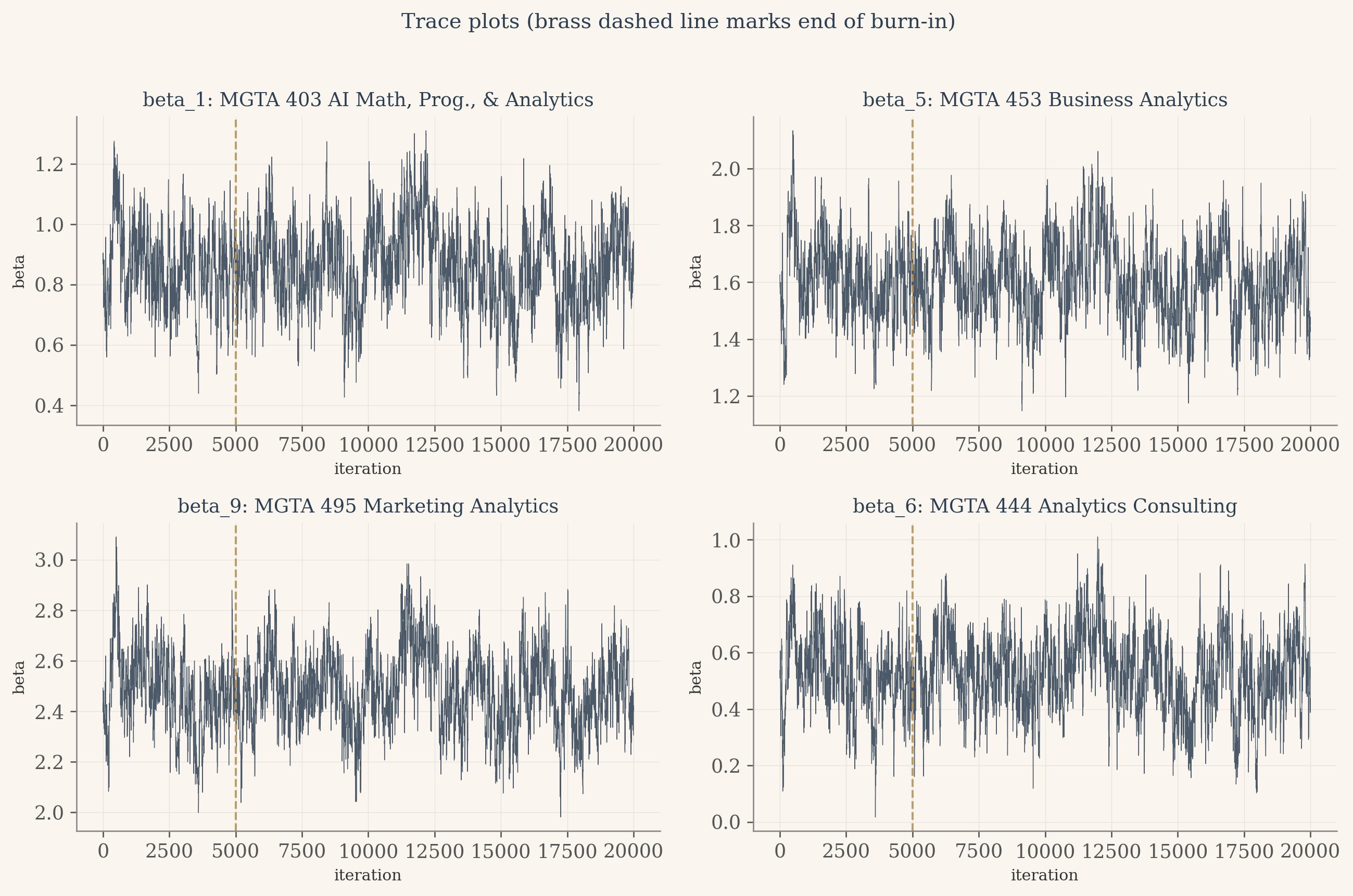
# Trace plots. The fuzzy caterpillar test: after burn-in the chain should# wander in a stable band with no trend, no stickiness, no drift.fig, axes = plt.subplots(2, 2, figsize=(11, 7), facecolor=CREAM)items_to_plot = [1, 5, 9, 6]for ax, item inzip(axes.flat, items_to_plot): ax.set_facecolor(CREAM) ax.plot(draws[:, item -1], color=NAVY, linewidth=0.4, alpha=0.85) ax.axvline(n_burn, color=BRASS, linestyle='--', linewidth=1.2, alpha=0.9) ax.set_title(f"beta_{item}: {ITEM_LABELS[item]}", fontsize=11, color=NAVY) ax.set_xlabel("iteration", fontsize=9) ax.set_ylabel("beta", fontsize=9) ax.grid(color='#e8e4dd', linewidth=0.4) ax.spines['top'].set_visible(False) ax.spines['right'].set_visible(False)plt.suptitle("Trace plots (brass dashed line marks end of burn-in)", fontsize=12, color=NAVY, y=1.02)plt.tight_layout()plt.show()
The traces tell a happy story. The chain settles quickly into a stable region around the maximum likelihood estimates, the brass dashed line marks the end of burn-in, and after that line every trace looks like a fuzzy caterpillar with no upward or downward drift. The bands of values around each beta are the chain exploring the posterior, sampling more often where the density is higher. No pathology, no chain getting stuck at a boundary, no obvious autocorrelation issues. The 30 percent acceptance rate from the pilot study is doing its job: rejecting often enough that the chain mixes, accepting often enough that it moves.
Show the code
# Per-parameter posterior summariespost_mean = post_draws.mean(axis=0)post_sd = post_draws.std(axis=0)post_2p5 = np.percentile(post_draws, 2.5, axis=0)post_97p5 = np.percentile(post_draws, 97.5, axis=0)# Posterior shares of preference. This is THE Bayesian payoff: push every draw# through the soft-max and read the credible interval directly off the# resulting empirical distribution.zeros_col = np.zeros((len(post_draws), 1))full_post = np.concatenate([post_draws, zeros_col], axis=1) # (15000, 11)m_row = full_post.max(axis=1, keepdims=True)exp_full = np.exp(full_post - m_row)share_draws = exp_full / exp_full.sum(axis=1, keepdims=True) # (15000, 11)share_mean = share_draws.mean(axis=0)share_2p5 = np.percentile(share_draws, 2.5, axis=0)share_97p5 = np.percentile(share_draws, 97.5, axis=0)
Show the code
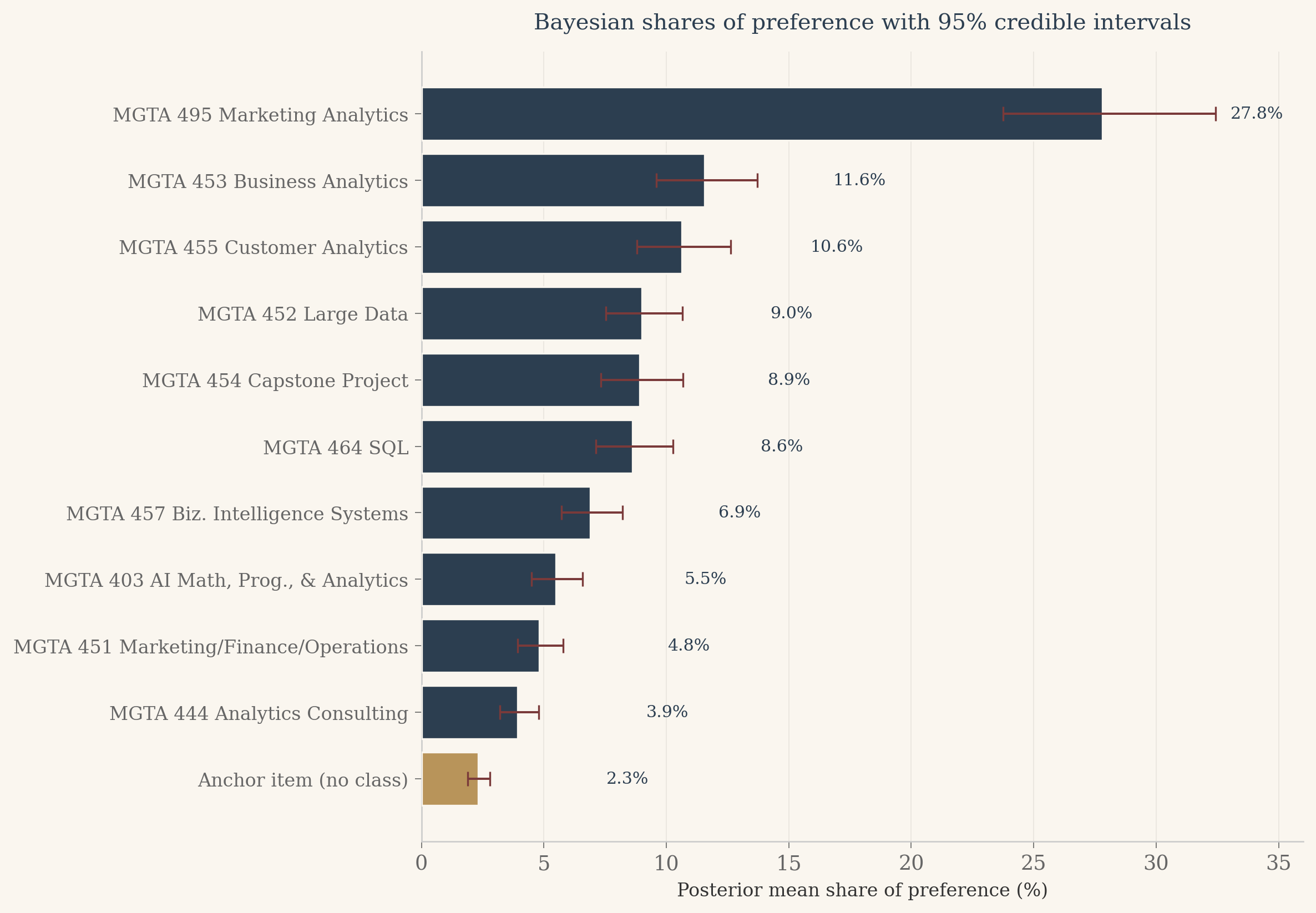
# Combined results tablebayes_rows = []for j inrange(1, 12):if j <=10: bm = post_mean[j -1] b_lo = post_2p5[j -1] b_hi = post_97p5[j -1] b_disp =f"{bm:+.3f}" bci_disp =f"[{b_lo:+.2f}, {b_hi:+.2f}]"else: b_disp ="0.000 (ref)" bci_disp ="" bayes_rows.append({'item': j,'label': ITEM_LABELS[j],'beta_disp': b_disp,'beta_ci': bci_disp,'share_pct': share_mean[j -1] *100,'share_ci': f"[{share_2p5[j-1]*100:.1f}%, {share_97p5[j-1]*100:.1f}%]" })bayes_df = pd.DataFrame(bayes_rows).sort_values('share_pct', ascending=False).reset_index(drop=True)html ='<div style="overflow-x:auto;"><table style="border-collapse:collapse;width:100%;font-size:0.88rem;">'html +='<thead><tr style="background:#2c3e50;color:#faf6ef;">'for col in ['Class', 'Posterior mean beta', '95% CrI on beta', 'Posterior mean share', '95% CrI on share']: html +=f'<th style="padding:10px 12px;text-align:left;">{col}</th>'html +='</tr></thead><tbody>'for i, row in bayes_df.iterrows(): bg ='#f5efe6'if i %2==0else'#faf6ef' anchor = (row['item'] ==11) name_style ='font-style:italic;color:#b8945a;'if anchor else'' html +=f'<tr style="background:{bg};">' html +=f'<td style="padding:7px 12px;{name_style}">{row["label"]}{" (reference)"if anchor else""}</td>' html +=f'<td style="padding:7px 12px;{name_style}">{row["beta_disp"]}</td>' html +=f'<td style="padding:7px 12px;{name_style}">{row["beta_ci"]}</td>' html +=f'<td style="padding:7px 12px;font-weight:600;color:#2c3e50;">{row["share_pct"]:.1f}%</td>' html +=f'<td style="padding:7px 12px;color:#2c3e50;">{row["share_ci"]}</td>' html +='</tr>'html +='</tbody></table></div>'HTML(html)
Class
Posterior mean beta
95% CrI on beta
Posterior mean share
95% CrI on share
MGTA 495 Marketing Analytics
+2.483
[+2.20, +2.78]
27.8%
[23.8%, 32.4%]
MGTA 453 Business Analytics
+1.605
[+1.34, +1.87]
11.6%
[9.6%, 13.7%]
MGTA 455 Customer Analytics
+1.520
[+1.25, +1.79]
10.6%
[8.8%, 12.6%]
MGTA 452 Large Data
+1.354
[+1.09, +1.63]
9.0%
[7.5%, 10.7%]
MGTA 454 Capstone Project
+1.343
[+1.06, +1.63]
8.9%
[7.3%, 10.7%]
MGTA 464 SQL
+1.311
[+1.06, +1.57]
8.6%
[7.1%, 10.3%]
MGTA 457 Biz. Intelligence Systems
+1.087
[+0.83, +1.35]
6.9%
[5.7%, 8.2%]
MGTA 403 AI Math, Prog., & Analytics
+0.860
[+0.59, +1.13]
5.5%
[4.5%, 6.6%]
MGTA 451 Marketing/Finance/Operations
+0.726
[+0.47, +0.99]
4.8%
[3.9%, 5.8%]
MGTA 444 Analytics Consulting
+0.525
[+0.25, +0.80]
3.9%
[3.2%, 4.8%]
Anchor item (no class) (reference)
0.000 (ref)
2.3%
[1.9%, 2.8%]
Show the code
# Headline chart: posterior mean share with 95% credible intervals.order_desc = np.argsort(-share_mean)sorted_items = [j +1for j in order_desc]sorted_labels = [ITEM_LABELS[j] for j in sorted_items]sorted_mean = share_mean[order_desc] *100sorted_lo = share_2p5[order_desc] *100sorted_hi = share_97p5[order_desc] *100colors_bars = [BRASS if it ==11else NAVY for it in sorted_items]fig, ax = plt.subplots(figsize=(10, 7), dpi=120)fig.patch.set_facecolor(CREAM)ax.set_facecolor(CREAM)y_pos = np.arange(len(sorted_items))[::-1]xerr_low = sorted_mean - sorted_loxerr_high = sorted_hi - sorted_meanax.barh(y_pos, sorted_mean, color=colors_bars, edgecolor=CREAM, linewidth=1.0, xerr=[xerr_low, xerr_high], error_kw={'ecolor': '#7a3a3a', 'capsize': 4, 'elinewidth': 1.2}, zorder=3)for yi, val inzip(y_pos, sorted_mean): ax.text(val +max(xerr_high) +0.6, yi, f'{val:.1f}%', va='center', ha='left', fontsize=9, color=NAVY, fontfamily='serif')ax.set_yticks(y_pos)ax.set_yticklabels(sorted_labels, fontsize=10)ax.set_xlim(0, float(np.ceil(sorted_hi.max() +3)))ax.set_xlabel("Posterior mean share of preference (%)", fontsize=10)ax.set_title("Bayesian shares of preference with 95% credible intervals", fontsize=12, color=NAVY, fontweight='500', fontfamily='serif', pad=12)ax.spines['left'].set_color('#ccc')ax.spines['bottom'].set_color('#ccc')ax.xaxis.grid(True, color='#e8e4dd', linewidth=0.5, zorder=0)ax.set_axisbelow(True)ax.tick_params(axis='both', colors='#666', width=0.5)plt.tight_layout()plt.show()
Show the code
# Posterior summaries vs MLE side by side.mle_se = se # length 10 from the MLE sectioncompare_rows = []for j inrange(1, 11): compare_rows.append({'item': j,'label': ITEM_LABELS[j],'mle_beta': beta_hat[j -1],'mle_se': mle_se[j -1],'post_mean': post_mean[j -1],'post_sd': post_sd[j -1], })cmp_b = pd.DataFrame(compare_rows)html ='<div style="overflow-x:auto;"><table style="border-collapse:collapse;width:100%;font-size:0.88rem;">'html +='<thead><tr style="background:#2c3e50;color:#faf6ef;">'for col in ['Class', 'MLE beta', 'MLE SE', 'Posterior mean', 'Posterior SD']: html +=f'<th style="padding:10px 12px;text-align:left;">{col}</th>'html +='</tr></thead><tbody>'for i, row in cmp_b.iterrows(): bg ='#f5efe6'if i %2==0else'#faf6ef' html +=f'<tr style="background:{bg};">' html +=f'<td style="padding:7px 12px;">{row["label"]}</td>' html +=f'<td style="padding:7px 12px;">{row["mle_beta"]:+.3f}</td>' html +=f'<td style="padding:7px 12px;">{row["mle_se"]:.3f}</td>' html +=f'<td style="padding:7px 12px;">{row["post_mean"]:+.3f}</td>' html +=f'<td style="padding:7px 12px;">{row["post_sd"]:.3f}</td>' html +='</tr>'html +='</tbody></table></div>'HTML(html)
Class
MLE beta
MLE SE
Posterior mean
Posterior SD
MGTA 403 AI Math, Prog., & Analytics
+0.868
0.131
+0.860
0.138
MGTA 464 SQL
+1.330
0.131
+1.311
0.133
MGTA 451 Marketing/Finance/Operations
+0.738
0.133
+0.726
0.134
MGTA 452 Large Data
+1.367
0.133
+1.354
0.137
MGTA 453 Business Analytics
+1.627
0.137
+1.605
0.135
MGTA 444 Analytics Consulting
+0.537
0.133
+0.525
0.138
MGTA 455 Customer Analytics
+1.539
0.136
+1.520
0.143
MGTA 454 Capstone Project
+1.357
0.134
+1.343
0.140
MGTA 495 Marketing Analytics
+2.493
0.144
+2.483
0.148
MGTA 457 Biz. Intelligence Systems
+1.091
0.129
+1.087
0.134
The two methods agree almost exactly, which is the expected story with a weakly informative prior and over a thousand observed choices. The posterior means sit within two hundredths of the MLE point estimates across all ten parameters, and the posterior standard deviations match the MLE standard errors to the nearest hundredth. So why bother with Bayes if it gives us the same answers?
Look at the credible interval on Marketing Analytics. Its share of preference is 27.8 percent with a 95 percent credible interval of roughly 24 to 32 percent. That interval is asymmetric, with more room on the upper side than the lower side, because shares of preference are bounded between 0 and 1 but the underlying utilities are not. The delta method around the MLE would have given a symmetric interval, which is slightly wrong in a direction that matters when communicating uncertainty to a non-technical audience. Bayes gives this for free: I push every draw through the soft-max, take percentiles, and the credible interval respects the geometry of the share space without any extra work.
Comparing the Three Methods
Three methods, one set of preferences. The counts approach takes the data at face value and tallies who won and who lost. Maximum likelihood fits a generative choice model and returns sharp point estimates with classical standard errors. The Bayesian sampler returns a full posterior on every quantity I might want to compute. The natural question: do they agree?
Show the code
# Pull counts score by item from the counts_df built earlier.counts_score_by_item =dict(zip(counts_df['item'], counts_df['score']))comparison = pd.DataFrame({'item': list(range(1, 12)),'label': [ITEM_LABELS[i] for i inrange(1, 12)],'counts_score': [counts_score_by_item[i] for i inrange(1, 12)],'mle_share': [shares[i -1] *100for i inrange(1, 12)],'bayes_mean_share':[share_mean[i -1] *100for i inrange(1, 12)],'bayes_2p5': [share_2p5[i -1] *100for i inrange(1, 12)],'bayes_97p5': [share_97p5[i -1] *100for i inrange(1, 12)],})comparison['counts_rank'] = comparison['counts_score'].rank(ascending=False).astype(int)comparison['mle_rank'] = comparison['mle_share'].rank(ascending=False).astype(int)comparison['bayes_rank'] = comparison['bayes_mean_share'].rank(ascending=False).astype(int)# Sort by Bayes rank for display.comparison = comparison.sort_values('bayes_rank').reset_index(drop=True)# Styled table: cream/navy/brass, anchor row italicized.html ='<div style="overflow-x:auto;"><table style="border-collapse:collapse;width:100%;font-size:0.88rem;">'html +='<thead><tr style="background:#2c3e50;color:#faf6ef;">'for col in ['Class', 'Counts score', 'Counts rank', 'MLE share', 'MLE rank', 'Bayes share', 'Bayes 95% CrI', 'Bayes rank']: html +=f'<th style="padding:10px 12px;text-align:left;">{col}</th>'html +='</tr></thead><tbody>'for i, row in comparison.iterrows(): bg ='#f5efe6'if i %2==0else'#faf6ef' anchor = (row['item'] ==11) name_style ='font-style:italic;color:#b8945a;'if anchor else'' ci_str =f"[{row['bayes_2p5']:.1f}%, {row['bayes_97p5']:.1f}%]" html +=f'<tr style="background:{bg};">' html +=f'<td style="padding:7px 12px;{name_style}">{row["label"]}{" (reference)"if anchor else""}</td>' html +=f'<td style="padding:7px 12px;{name_style}">{row["counts_score"]:+.3f}</td>' html +=f'<td style="padding:7px 12px;">{int(row["counts_rank"])}</td>' html +=f'<td style="padding:7px 12px;{name_style}">{row["mle_share"]:.1f}%</td>' html +=f'<td style="padding:7px 12px;">{int(row["mle_rank"])}</td>' html +=f'<td style="padding:7px 12px;font-weight:600;color:#2c3e50;">{row["bayes_mean_share"]:.1f}%</td>' html +=f'<td style="padding:7px 12px;color:#2c3e50;">{ci_str}</td>' html +=f'<td style="padding:7px 12px;">{int(row["bayes_rank"])}</td>' html +='</tr>'html +='</tbody></table></div>'HTML(html)
Class
Counts score
Counts rank
MLE share
MLE rank
Bayes share
Bayes 95% CrI
Bayes rank
MGTA 495 Marketing Analytics
+0.567
1
27.8%
1
27.8%
[23.8%, 32.4%]
1
MGTA 453 Business Analytics
+0.269
2
11.7%
2
11.6%
[9.6%, 13.7%]
2
MGTA 455 Customer Analytics
+0.251
3
10.7%
3
10.6%
[8.8%, 12.6%]
3
MGTA 452 Large Data
+0.183
5
9.0%
4
9.0%
[7.5%, 10.7%]
4
MGTA 454 Capstone Project
+0.167
6
8.9%
5
8.9%
[7.3%, 10.7%]
5
MGTA 464 SQL
+0.162
7
8.7%
6
8.6%
[7.1%, 10.3%]
6
MGTA 457 Biz. Intelligence Systems
+0.057
8
6.8%
7
6.9%
[5.7%, 8.2%]
7
MGTA 403 AI Math, Prog., & Analytics
-0.042
9
5.5%
8
5.5%
[4.5%, 6.6%]
8
MGTA 451 Marketing/Finance/Operations
-0.080
10
4.8%
9
4.8%
[3.9%, 5.8%]
9
MGTA 444 Analytics Consulting
-0.155
11
3.9%
10
3.9%
[3.2%, 4.8%]
10
Anchor item (no class) (reference)
+0.227
4
2.3%
11
2.3%
[1.9%, 2.8%]
11
Show the code
# Three-panel comparison chart. Sort items by Bayes rank for a consistent vertical order.order = comparison['item'].tolist()labels_ordered = comparison['label'].tolist()anchor_mask = [i ==11for i in order]fig, axes = plt.subplots(1, 3, figsize=(15, 7), facecolor=CREAM, sharey=True, dpi=120)methods = [ ('Counts score', comparison['counts_score'].values, None, None), ('MLE share (%)', comparison['mle_share'].values, None, None), ('Bayesian share (%)', comparison['bayes_mean_share'].values, comparison['bayes_2p5'].values, comparison['bayes_97p5'].values),]y_pos = np.arange(len(order))[::-1]for ax, (title, values, lo, hi) inzip(axes, methods): ax.set_facecolor(CREAM) colors = [BRASS if a else NAVY for a in anchor_mask]if lo isnotNoneand hi isnotNone: xerr = [values - lo, hi - values] ax.barh(y_pos, values, color=colors, xerr=xerr, error_kw={'ecolor': '#7a3a3a', 'capsize': 3, 'elinewidth': 1.2}, edgecolor=CREAM, linewidth=0.8, zorder=3)else: ax.barh(y_pos, values, color=colors, edgecolor=CREAM, linewidth=0.8, zorder=3) ax.set_yticks(y_pos) ax.set_yticklabels(labels_ordered, fontsize=9) ax.set_title(title, fontsize=12, color=NAVY, fontfamily='serif', pad=10) ax.spines['top'].set_visible(False) ax.spines['right'].set_visible(False) ax.spines['left'].set_color('#ccc') ax.spines['bottom'].set_color('#ccc') ax.xaxis.grid(True, color='#e8e4dd', linewidth=0.5, zorder=0) ax.set_axisbelow(True) ax.tick_params(axis='both', colors='#666', width=0.5)fig.suptitle('Three methods, side by side, sorted by Bayesian rank', fontsize=13, color=NAVY, fontfamily='serif', y=1.02)plt.tight_layout()plt.show()
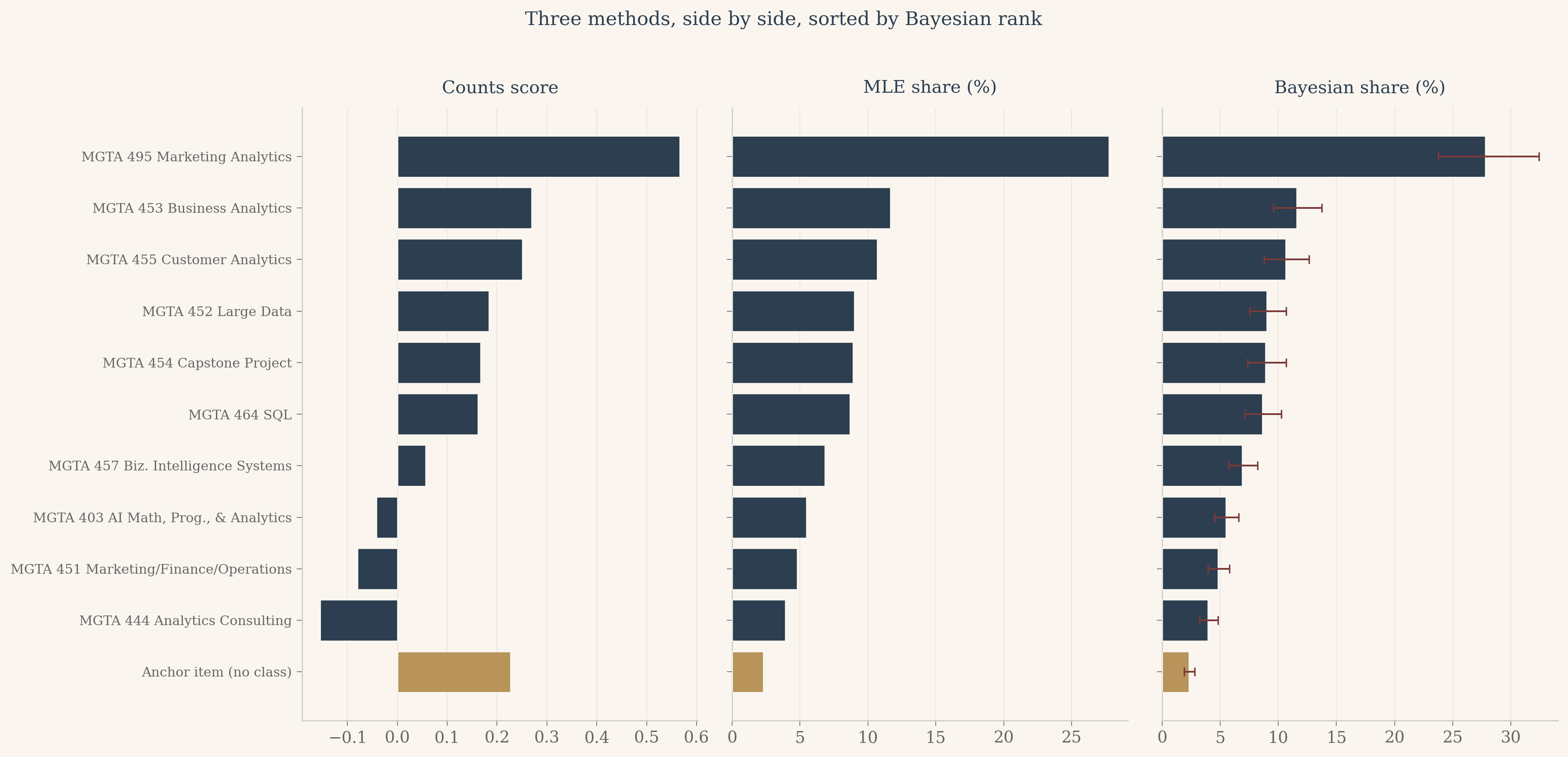
Three findings from the side-by-side view. The agreement at the extremes is total. Marketing Analytics is rank 1 in all three methods. Analytics Consulting is rank 10 in all three. The anchor sits at the bottom of every panel, which it should. The methods disagree slightly in the middle, where the utility gaps between classes are small enough that the choice of method matters more than the choice of class. None of these middle swaps cross more than two ranks, so for any practical question about which classes the cohort prefers, the three methods tell the same story.
The Bayesian panel is the most informative of the three. The error bars on each bar communicate uncertainty in a way the other two panels cannot. A reader who knows nothing about statistics can look at the Bayesian panel and see immediately that the gap between Marketing Analytics and the next class is real (the intervals do not overlap), while the gaps between the middle classes are uncertain (the intervals overlap freely). This is the practical payoff for the extra modeling effort.
Discussion
What the cohort likes
The headline finding from this survey is that the MSBA cohort strongly prefers Marketing Analytics over every other class. Its share of preference is roughly twenty-eight percent, more than twice the share of any other class. Three other classes form a clear second tier: Business Analytics, Customer Analytics, and Large Data, each between nine and twelve percent. The middle of the field, Capstone, SQL, BI Systems, and AI Math, is bunched between five and nine percent. Marketing/Finance/Operations and Analytics Consulting bring up the rear at under five percent each. The anchor item, which had no real class attached, sits below every actual course.
I should flag the obvious caveat. This survey was administered to MSBA students who are in the middle of taking these classes. Their preferences are shaped by recency, by the instructor’s personality on the day they responded, by whether they happened to be enjoying the homework that week. A survey of alumni a year out, asking which class proved most useful in their job, would almost certainly produce a different ranking.
When to use which method
Each of the three methods earns its keep in different contexts.
Counts are fast, simple, and the right tool for dashboards and quick exploratory looks. Anyone with a spreadsheet can compute them. The cost is that counts ignore information about non-picks and offer no natural way to express uncertainty.
Maximum likelihood gives sharp point estimates and standard errors at almost no extra computational cost. For most product analytics questions, MLE shares of preference are the right primary deliverable. The standard errors travel cleanly into the kinds of questions marketers actually ask, like “is the gap between A and B real or noise?” The cost is that turning standard errors on the betas into intervals on the shares of preference requires the delta method, which is mechanical but easy to get wrong and inherits the symmetry of the underlying normal approximation.
Bayesian estimation costs more in compute and code but pays for itself whenever I want to make a probabilistic statement about anything derived from the parameters. Credible intervals on shares of preference, on rank orderings, on the probability that one class beats another, all come directly from the posterior draws without any extra derivation. Bayes is also the method I would reach for if I had to combine this survey with prior information from a previous cohort, which counts and MLE cannot do without significant extra plumbing.
What I would do next
Three extensions would make this analysis more useful, in order of payoff.
First, hierarchical modeling. The current MNL pools all 85 respondents into a single set of utilities. A hierarchical version would estimate one set of utilities per respondent, partially pooled toward a cohort mean. This is the standard upgrade in industry conjoint analysis and it would let me say things like “this fraction of the cohort strongly prefers Marketing Analytics, that fraction prefers Customer Analytics”. The Bayesian framework I built here extends to hierarchical models with surprisingly little additional code.
Second, covariates. If I had demographic or background information on the respondents (prior industry, undergraduate major, intended post-MSBA role), I could fit interactions and learn which classes appeal to which student segments. This is a small extension of the MNL framework.
Third, design diagnostics. The maxdiff design here uses 8 four-item screens plus 7 two-item anchor screens per respondent. A formal D-optimal design check would tell me whether that allocation of screens could have been improved, and whether the anchor item was earning its place in the survey or wasting respondent attention. This is the kind of question Dan’s class is built to answer and I would enjoy doing it for the final project.
Take the Survey Yourself
Twelve quick MaxDiff screens. On each one, pick the class you like best and the class you like least from the four shown. At the end, your browser fits the same MNL by maximum likelihood (with light L2 regularization, because twelve tasks is a thin diet for ten parameters), then puts your personal shares of preference next to the cohort’s so you can see where you agree and where you part ways.