A credit card brand came to us with a deceptively simple question: of all the things customers say about us, which perceptions actually drive how satisfied they are? They have nine perception statements, from “is offered by a brand I trust” to “makes a difference in my life”, and a one to five satisfaction rating. The trouble is that “importance” is not one number. There are many competing ways to measure it, and a perception that looks central under one lens can fade under another. So rather than pick a single method and hope, let us run six of them side by side and see which perceptions hold their ground no matter how we ask the question.
Each method below carries its own logic and its own blind spot. The payoff is at the bottom: a single table, styled like our slide, that lines all six up so the consensus drivers reveal themselves.
Animated walkthrough
Loading interactive walkthrough...
1 / 8
Setup
We load the survey, name the nine perception columns, and define two small helpers we will lean on throughout: a norm100 that rescales any set of scores so the column sums to 100 percent, and an r2 that fits an ordinary least squares model on a chosen set of perception columns and returns its R squared. Almost every method below is a different recipe built from these same two ingredients.
Show the code
import numpy as npimport pandas as pdfrom itertools import combinationsfrom math import factorialimport statsmodels.api as smfrom sklearn.ensemble import RandomForestRegressordf = pd.read_csv("data/data_for_drivers_analysis.csv")perceptions = ["trust", "build", "differs", "easy", "appealing","rewarding", "popular", "service", "impact"]labels = {"trust": "Is offered by a brand I trust","build": "Helps build credit quickly","differs": "Is different from other cards","easy": "Is easy to use","appealing": "Has appealing benefits or rewards","rewarding": "Rewards me for responsible usage","popular": "Is used by a lot of people","service": "Provides outstanding customer service","impact": "Makes a difference in my life",}y = df["satisfaction"].astype(float)X = df[perceptions].astype(float)Xv, yv = X.values, y.valuesn, p = Xv.shapedef norm100(v): v = np.asarray(v, dtype=float)return100.0* v / v.sum()def r2(cols): cols =list(cols)iflen(cols) ==0:return0.0 A = sm.add_constant(Xv[:, cols])return sm.OLS(yv, A).fit().rsquared# House chart styling: cream paper, navy bars, brass for the consistent top drivers.import matplotlib as mplimport matplotlib.pyplot as pltfrom matplotlib.colors import LinearSegmentedColormapNAVY, BRASS, CREAM ="#2c3e50", "#b8945a", "#faf6ef"TOP = {"trust", "service", "impact"}short = {"trust": "Trust", "build": "Build credit", "differs": "Different","easy": "Easy to use", "appealing": "Appealing", "rewarding": "Rewarding","popular": "Popular", "service": "Service", "impact": "Impact",}mpl.rcParams.update({"figure.facecolor": CREAM, "axes.facecolor": CREAM, "savefig.facecolor": CREAM,"font.family": "serif", "font.size": 11,"text.color": NAVY, "axes.labelcolor": NAVY,"xtick.color": NAVY, "ytick.color": NAVY,"axes.edgecolor": "#cccccc", "axes.linewidth": 0.6,})def kd_barh(scores, title):"""Horizontal bar chart of one method's importances, largest on top, top drivers in brass.""" d =dict(zip(perceptions, np.asarray(scores, dtype=float))) order =sorted(perceptions, key=lambda k: d[k]) vals = [d[k] for k in order] colors = [BRASS if k in TOP else NAVY for k in order] fig, ax = plt.subplots(figsize=(7.2, 3.7), dpi=130) ax.barh(range(len(order)), vals, color=colors, edgecolor=CREAM, linewidth=1.2, height=0.72) ax.set_yticks(range(len(order))) ax.set_yticklabels([short[k] for k in order]) ax.set_xlabel("Importance (percent of total)") ax.set_title(title, loc="left", fontsize=13, fontweight="bold", color=NAVY, pad=10) ax.spines["top"].set_visible(False) ax.spines["right"].set_visible(False)for i, v inenumerate(vals): ax.text(v +max(vals) *0.015, i, f"{v:.1f}", va="center", ha="left", fontsize=9, color=NAVY) ax.set_xlim(0, max(vals) *1.16) ax.tick_params(length=0) plt.tight_layout() plt.show()
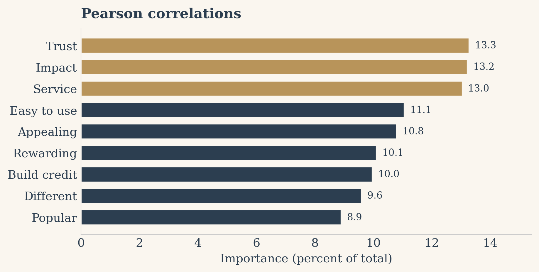
1. Pearson correlations
The simplest lens. We measure how tightly each perception moves with satisfaction on its own, one variable at a time, and take the absolute value so a strong negative counts as much as a strong positive. Its blind spot is that it ignores the other eight perceptions entirely: if two statements say nearly the same thing, both get full credit and the picture looks more spread out than it really is.
Show the code
pearson = np.array([abs(np.corrcoef(X[c], y)[0, 1]) for c in perceptions])pearson = norm100(pearson)kd_barh(pearson, "Pearson correlations")
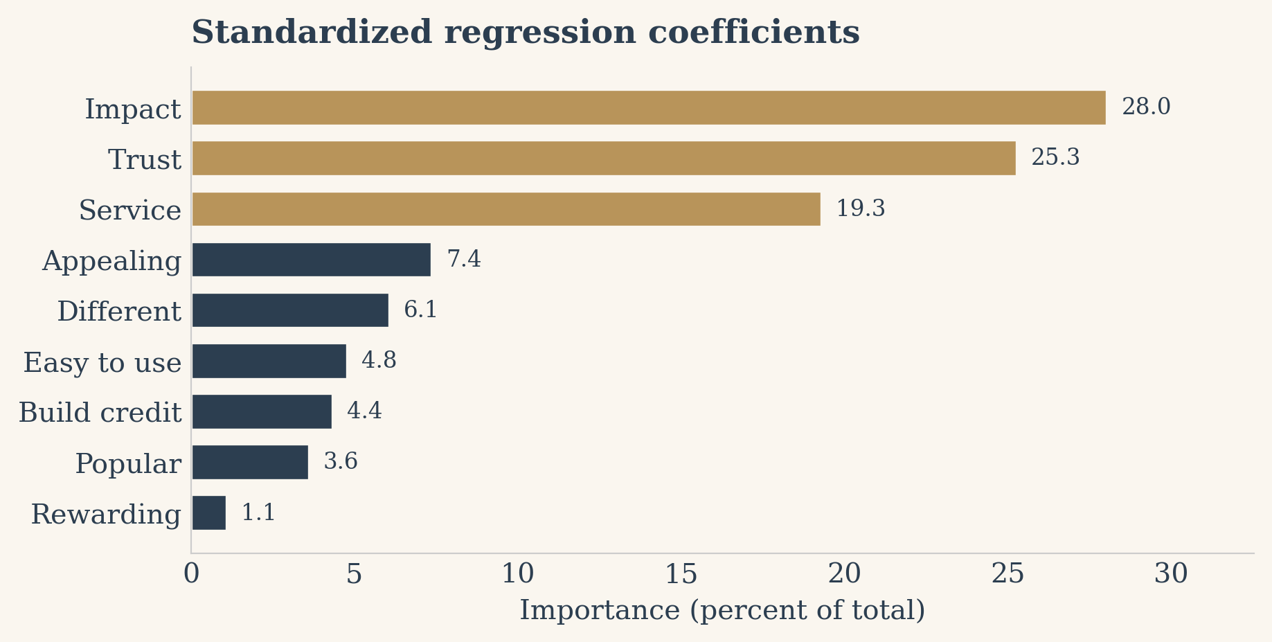
2. Standardized regression coefficients
Here we put every variable on the same footing by z-scoring satisfaction and all nine perceptions, then fit one regression of standardized satisfaction on all nine standardized perceptions at once. The absolute slopes, normalized, tell us each perception’s unique pull once the others are held constant. The blind spot is the mirror image of correlation: when perceptions are correlated, the model splits the shared credit somewhat arbitrarily, so a genuinely important driver can be handed a small coefficient.
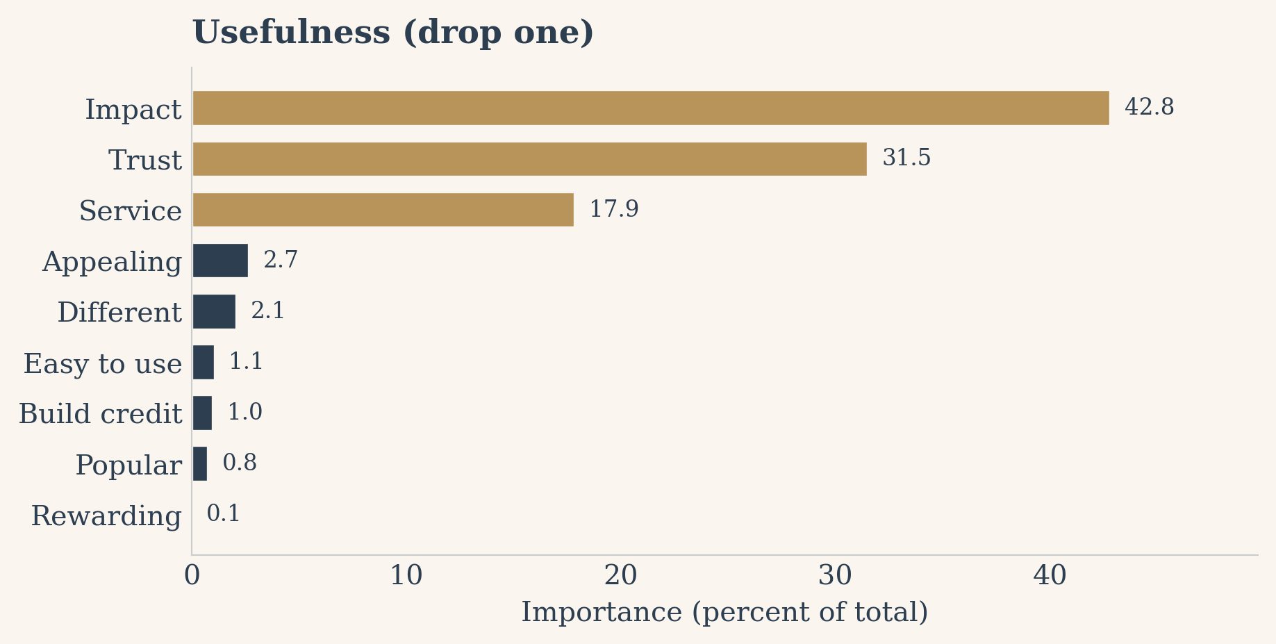
This asks a concrete question: how much worse does the full model predict satisfaction if we remove this one perception? We fit the full nine-variable model, record its R squared, then drop each perception in turn and measure the fall in R squared. The blind spot is that it only credits a variable for what is uniquely its own; anything it shares with a correlated neighbor is invisible here, so the drops can look tiny even for important drivers.
Show the code
full_r2 = r2(range(p))drops = []for j inrange(p): cols = [k for k inrange(p) if k != j] drops.append(full_r2 - r2(cols))usefulness = norm100(np.array(drops))kd_barh(usefulness, "Usefulness (drop one)")
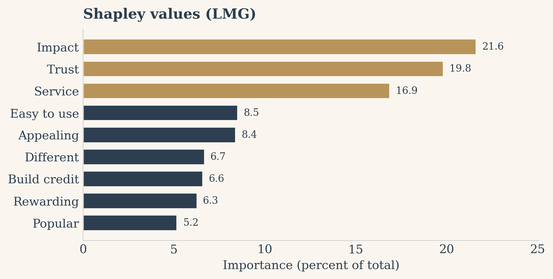
4. Shapley values (LMG)
The Shapley or LMG approach fixes the credit-sharing problem head on. For each perception it computes the marginal bump in R squared it adds, averaged over every possible subset of the other eight, weighted so that subset sizes count equally. Because we evaluate all 2 to the 9 subsets, this is exact rather than sampled, and it is the fairest division of explained variance we have. Its only real cost is compute, which here is trivial. We implement it from scratch with itertools.combinations and our r2 helper.
Show the code
# Cache R squared for every subset we touch so we never refit the same model twice.r2_cache = {}def r2_cached(cols): key =tuple(sorted(cols))if key notin r2_cache: r2_cache[key] = r2(key)return r2_cache[key]shapley = np.zeros(p)for j inrange(p): others = [k for k inrange(p) if k != j] contribution =0.0for size inrange(p): # subset of others has size 0..p-1 weight = factorial(size) * factorial(p - size -1) / factorial(p)for subset in combinations(others, size): without_j = r2_cached(subset) with_j = r2_cached(tuple(subset) + (j,)) contribution += weight * (with_j - without_j) shapley[j] = contributionshapley = norm100(shapley)kd_barh(shapley, "Shapley values (LMG)")
5. Johnson’s relative weights (epsilon)
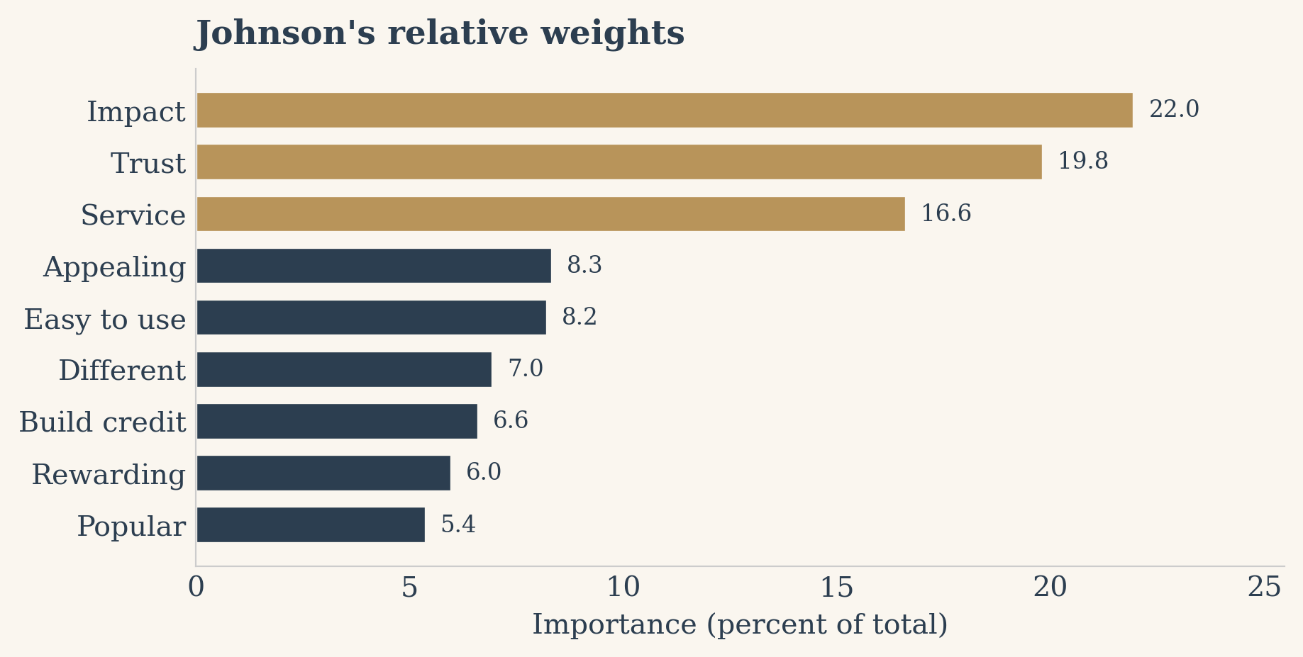
Johnson’s 2000 method is a clever shortcut to nearly the same answer as Shapley, at a fraction of the cost. It builds a set of orthogonal variables that stand in for the correlated perceptions, regresses satisfaction on those, then hands each original perception a share of the explained variance based on how strongly it loads onto each orthogonal stand-in. Its blind spot is subtle: it approximates rather than evaluates every subset, so it can drift a touch from the exact Shapley split, though in practice the two agree closely.
Show the code
U, S, Vt = np.linalg.svd(Xz.values, full_matrices=False)Z = U @ Vt # orthogonal approximation of standardized XLambda = Z.T @ Xz.values / n # how each perception loads on each Z columnbeta_z = np.linalg.lstsq(Z, yz.values, rcond=None)[0]johnson = np.array([np.sum((Lambda[j, :] **2) * (beta_z **2)) for j inrange(p)])johnson = norm100(johnson)kd_barh(johnson, "Johnson's relative weights")
6. Random forest Gini importance
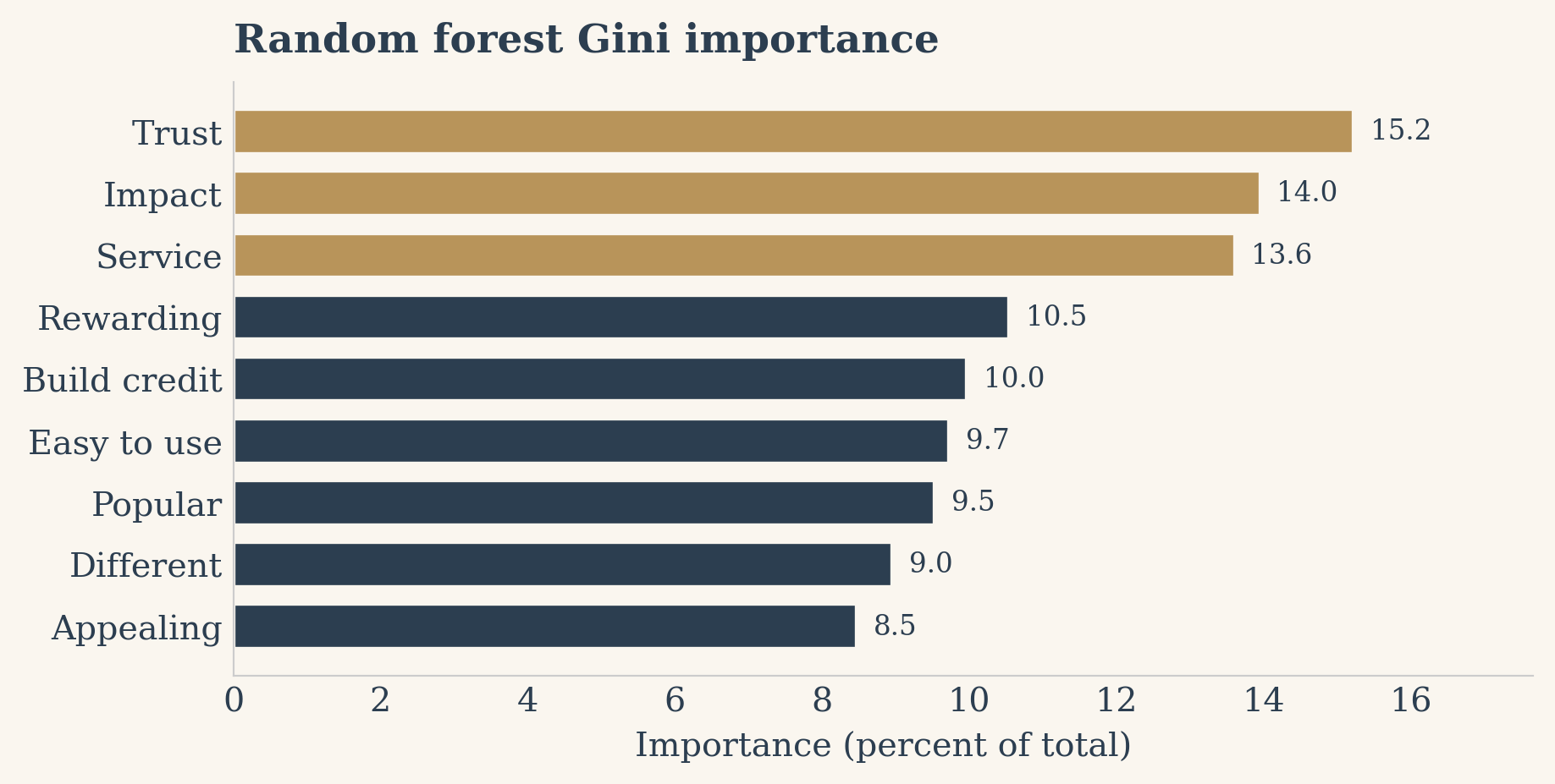
Finally a non-linear lens. A random forest grows five hundred trees on the raw perceptions and, for each, records how much each perception reduces impurity when it is used to split, the mean decrease in impurity. This captures interactions and non-linearities the regressions cannot. Note that this column is sensitive to tree depth and will not match the slide’s flat values near eleven percent, which used a different importance variant; treat it as a directional cross-check rather than a precise match.
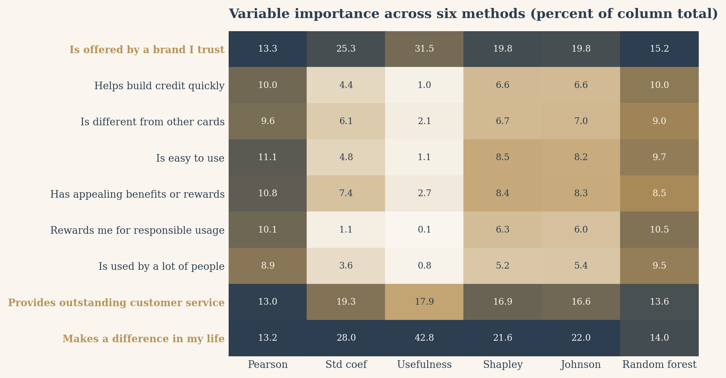
Six very different questions, one table. Each column is normalized to sum to 100 percent and shown to one decimal place, with perceptions in the slide’s order. The three consistent top drivers, trust, service, and makes a difference in my life, are highlighted: they lead under nearly every method.
Each column normalized to sum to 100 percent. Highlighted rows are the consistent top drivers.
The same numbers read even faster as a heatmap. Each column is shaded from cream (low) to navy (high) on its own scale, so the darkest cell in every column is that method’s top driver. Trust, service, and impact form the dark band that holds across all six.
Show the code
methods_short = ["Pearson", "Std coef", "Usefulness", "Shapley", "Johnson", "Random forest"]M = results.loc[perceptions, method_cols].valuesMn = M / M.max(axis=0, keepdims=True)cmap = LinearSegmentedColormap.from_list("kd_cream_navy", [CREAM, BRASS, NAVY])fig, ax = plt.subplots(figsize=(9, 4.9), dpi=130)ax.imshow(Mn, aspect="auto", cmap=cmap, vmin=0, vmax=1)ax.set_xticks(range(len(method_cols)))ax.set_xticklabels(methods_short, fontsize=9)ax.set_yticks(range(len(perceptions)))ax.set_yticklabels([labels[k] for k in perceptions], fontsize=9)for tick, k inzip(ax.get_yticklabels(), perceptions):if k in TOP: tick.set_color(BRASS) tick.set_fontweight("bold")for i inrange(len(perceptions)):for j inrange(len(method_cols)): tc = CREAM if Mn[i, j] >0.55else NAVY ax.text(j, i, f"{M[i, j]:.1f}", ha="center", va="center", fontsize=8, color=tc)ax.set_title("Variable importance across six methods (percent of column total)", loc="left", fontsize=12, fontweight="bold", color=NAVY, pad=12)ax.tick_params(length=0)for s in ax.spines.values(): s.set_visible(False)plt.tight_layout()plt.show()
What the table tells us
Look down any single column and you could tell six slightly different stories. Look across all six and the noise cancels. Trust, outstanding customer service, and the sense that the card makes a difference in someone’s life rise to the top under correlation, under regression, under the exact Shapley split, under Johnson’s weights, and under the forest. That convergence is the real takeaway of a key drivers analysis: not the precise percentages in any one method, but the handful of perceptions that refuse to fade no matter how you ask the question. Those are where the brand should invest.
Try it yourself
Tap through the six methods below and watch the ranking rearrange. The bars rescale to each method’s own top score, so the longest bar is always that method’s leading driver. The point reveals itself: trust, service, and impact keep their place near the top no matter which lens you pick.
Explore the methods
Click a method to rank the nine perceptions its way. The three drivers in brass are the ones that hold across every method.